How EVRY won gold for best idea and design of annual report in the Farmand Prize
EVRY one of the largest IT companies in the Nordics. Far from providing customary IT infrastructure, EVRY guide and advise their clients to capitalise on this new frontier. We were tasked to create brand communication that demonstrates how they create value for business leaders in the Nordic region
I sat down with Hege Homstvedt, Senior Designer at Mission, to discuss EVRY’s Farmand Prize win, preparing for this year, and how to design annual reports in the digital age.
We did really well in the Farmand Prize last year. How did things go for us there?
It wasn't just us. It was EVRY that did well. They won gold in the "Idea and Design" and "Best Website - Not Listed" categories, and silver in the "Online Annual Report" category.
They had quite big ambitions in advance when it came to the Farmand Prize, did they not?
They communicated their high ambitions at an early stage and that they would deliver this in to Farmand.
And now you are in the final phase of this year's version. What is important for you when it comes to annual reports?
An annual report is a unique genre. It is of course a very specific target group that reads them. They have a very important, but often dry content. There are a lot of figures, a lot of strategy and a lot of text. So, the trick is to also try to make it more easily read and easily understood for people who are not very knowledgeable about accounting. It is important to have a concept and a consistent common thread when it comes to the design.
What was the common thread in last year's edition?
Last year's version was called DigitalAdvantage, the same as the customer's new, strategic message. EVRY did a re-branding last year, so this was a common thread for the entire process. Digital Advantage is still the strategic message but the concept for this year's report is Customer-Centric innovation. This is where we explain how DigitalAdvantage is made visible or looks for clients and the results of this for them and for the client's customers in particular. We want to explain what EVRY actually do, what they deliver, try to explain this to someone who doesn't have an IT background, for example.
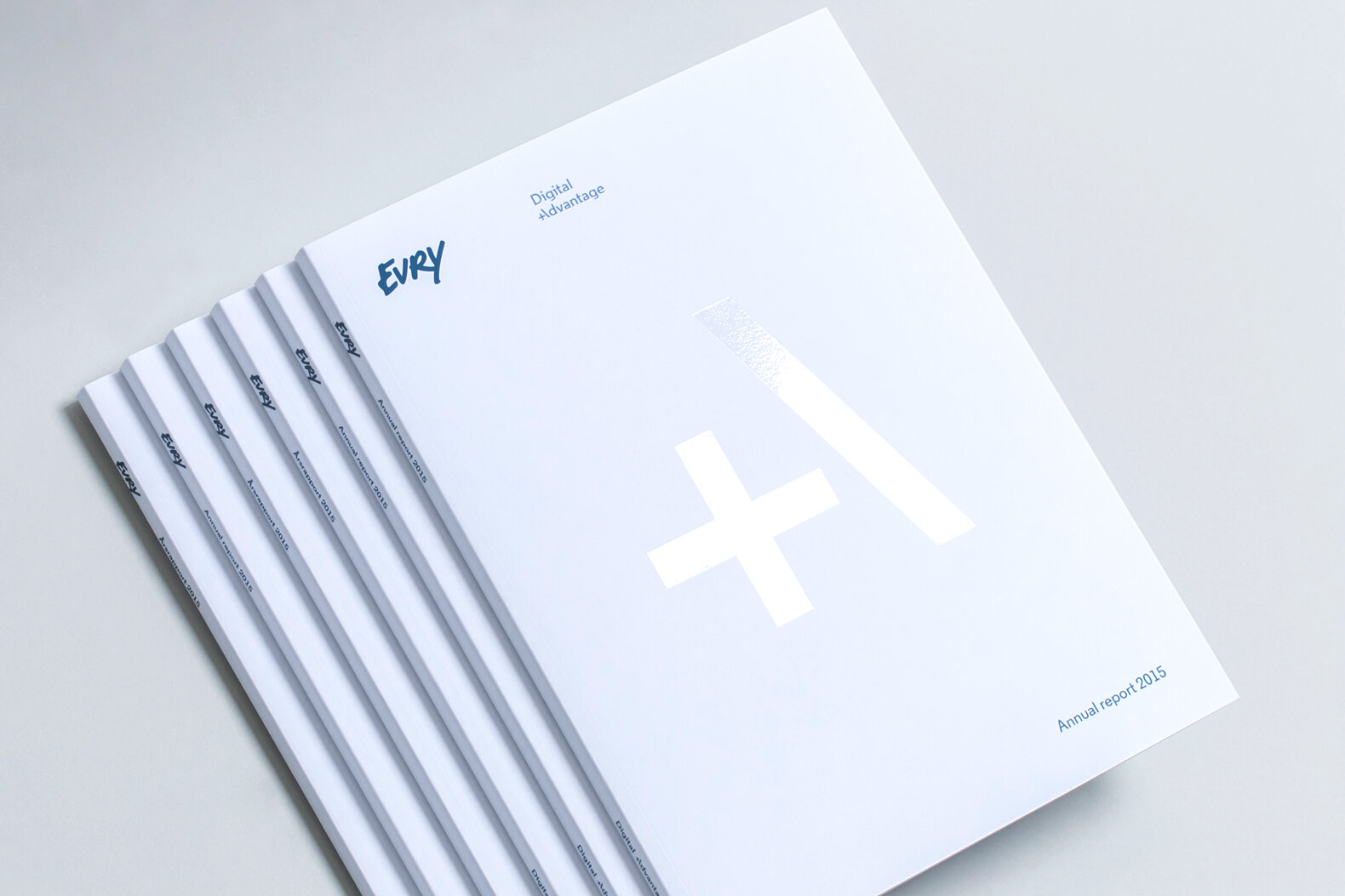
EVRY Annual Report 2015
Does this mean that you use the annual report as something more than just a financial report?
Yes, it could be used in several ways. I know that EVRY have used the digital version in several presentations for investors.
When it comes to digital annual reports, we allow ourselves slightly more exciting methods when creating an annual report on...
On the Internet, you need to think in a completely different way. An annual report has a great deal of content and text and it is not as compatible with a screen, particularly not with smaller formats like mobile phones or iPads. So, you then need to split the information up in a different way, make the text-heavy sections downloadable PDFs, for example.It's a combination of overarching divisions into chapters and this is the lower face of the Internet version, but you can download more detailed text in your own PDFs. So, you can obviously have videos then, or animations, which we did for EVRY. It makes the annual report much more alive ... and interactive.
Aren't you then moving into something a bit different from what an annual report has usually involved? Where it almost takes on the character of something entertaining. Not entertainment perhaps, but using the media in a different way.
We use it as an extended company brochure. Very few people publish these nowadays, most use their own website. But if you think along those lines, you can combine it with the annual report.
Annual reports have traditionally been frowned upon, is this still true?
Yes and no. I remember Anne Lindmo, the master of ceremonies at the Visuelt prize-giving, arranged by Grafill, one year. When she reached the Annual Report category, she introduced this by saying this was ”boring shit in nice wrapping” with a twinkle in her eye. Part of our job is ensuring that it is much more than just that.
Is it easier to make an annual report exciting online?
Well, being able to put in bits of video and other things can soften the impression it makes and make it more interesting for people other than investors and those considering whether they should buy a share or two. The fact that the Farmand Prize has a category called Idea and Design suggests that it is of great value getting it to look nice too and that it is not just about accounting figures.
Are there many people who still treat the annual report unfairly, do you think?
We do notice that it is a necessary evil for some people, that it's something that just needs to be done. For others, it is a useful summary of last year's work. It's like a lot of other things, people are most preoccupied with the things that are important for what they personally work at on a daily basis.
Will economists control the design?
It's not completely true that the economists control the design. It is usually controlled by the marketing department or suchlike. Accounts supply the figures and that section is treated in an individual way.
What do you like best about the job you did last year, the one EVRY won with?
The digital element is definitely the most exciting part, I think. I think we succeeded in making the annual report a more interesting and exciting medium with nice effects.
What kind of differences do you need to think about between the paper version and the electronic variant?
There should be a clear link between the paper version and the electronic one. Ideally, there should be holistic thinking and the same concept and terms. But they are two completely different mediums, so a lot of things need to be adapted, like the amount of text, legibility on the screen and that things will be responsive to different screen sizes and media.
So even on a mobile phone you should be able to read an annual report?
You should also be able to read on mobile, but I wouldn't want to recommend reading these attachments there, then it's better e-mailing yourself a PDF, for example. If you are going to read it, I would recommend an iPad or something similar. But this is of course part of the task, the way I see it, bringing out some of the key information so that all those not reading everything in detail can get the main points. That is something we have worked quite a lot on this year, together with the client, getting small anecdotes, figures, graphs and then using them alongside the running long text. If you are just going to skim through it, you will get the main points.
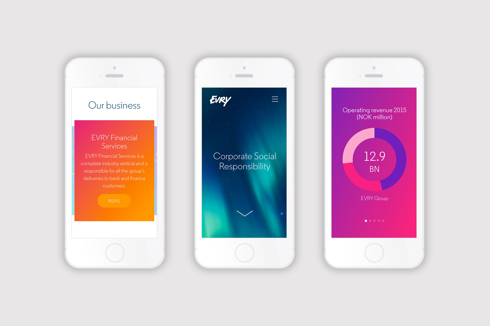
EVRY - annual report on mobile
Is having neat folds on everything one of the most important things when it comes to creating annual reports?
Having a system that works is extremely important. It is important to be playful, but within certain limits. That is probably why many designers feel that annual reports are a problem, because there are such very comprehensive rules regarding what you can and cannot do.
Have you managed to turn things around a bit so that you can see the challenge of operating in such a narrow field?
Fortunately, we have a customer who wants to do something exciting in this area and who wants to win the Farmand prize - and enthuse the jury.
What is the difference between this year's product and last year's?
I don't know whether I should reveal our secret tricks here! We have received feedback from last year's jury and read it very carefully. We have also been working with someone from an accounting firm, someone who is a specialist in annual reports. Someone who can look at it in relation to how reporting should be done, what should be done in relation to targets and objectives and how to support this with results.
So it is all about presenting the figures in the most correct manner?
Not just the figures, but the kind of strategy the company has for the future. What are their targets? What have they done to reach the targets and what results do they have? We have also created more graphs in relation to figures and results, something that makes everything clearer and more accessible. We have also had some new ideas about navigation in the printed version. We have split it into clearer chapters and a colour code, but the biggest steps probably relate to the content. This applies to both the online and printed versions. In addition, both versions need to work in both English and Norwegian.
Have you had a lot of visits from EVRY here at the agency lately?
Yes, there is a lot of proofreading and corrections involved in a project like this, so it has been good having such a short path between EVRY and the designers.
Is it part of the working conditions that things need to be extremely hectic at the end of a proper annual report?
In the annual reports I have done, things have always been hectic at the end. This has affected Easter holidays, getting a good night's sleep and suchlike. But this is because the content often arrives very late in relation to the deadline, which is the AGM. The date is often carved in stone and is seldom possible to move. And there is a lot of hair-splitting at the end, with internal proofreading, and auditors and solicitors who are preoccupied with everything being correct. There are many stakeholders at EVRY who are involved and who need to approve the content concerning their areas of responsibility. That is why the proofreading rounds get a bit more complicated than they would be if only a couple of people were involved. What is new this year is that even a few clients are involved, with three customer cases that show what EVRY delivers to its customers and how these services make a difference to the customer's working day.
What cases are involved?
These are Sparebank 1 for EVRY Financial Services, for EVRY Norway we have Telenor and for Sweden we have Näcka Municipality, the last-named in a combination with Smarter Cities solutions.
What are the ambitions for this year's Farmand Prize?
It depends on who you ask. The Client wants to achieve the best possible results in the competition. But no one can guarantee gold. It all depends on so many things. Is it the same jury as last year? The criteria are probably the same but different people can interpret things differently. And what are our competitors doing? That is actually what is most important. What do they deliver?
What do you think has been improved in this year's report? Is it the clarity?
I have nothing on which to base how an accountant perceives it, but in my opinion, we have been good at showing the client's customers what EVRY represents, what they do, what they deliver and, in addition, we have managed to show the results more clearly using graphs etc. I personally think that the creative side has been even better than last year. And I feel the client has been even more open to suggestions and new things this year as well, so it has been very positive.
Read our EVRY case study here .


