
Peter Saville refines Aston Martin's winged logo in "edgier" brand update
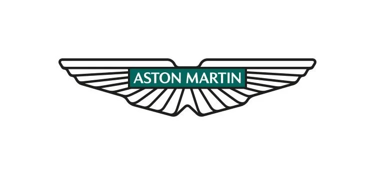
Aston Martin has updated its branding – including a new version of its winged logo redrawn by Peter Saville – as it looks to appeal to a new generation of drivers.
It is the British car brand's first major overhaul since 2003. The design work also includes a range of social, digital and print assets as well as a campaign video. The principle behind the new work is “Intensity.Driven”.
This is only the eighth time that the logo has been updated in Aston Martin's 109-year history. The winged variation of Aston Martin's logo was introduced in 1927, where the brand's name took the shape of wings.
In 1932, a new version – designed by SCH Davis – introduced the wings around a wordmark, taking inspiration from scarab beetles. In mythology, these insects often symbolize new beginnings, according to Aston Martin.
Credits
Client: Aston Martin
Creatives: Peter Saville
Source: Designweek