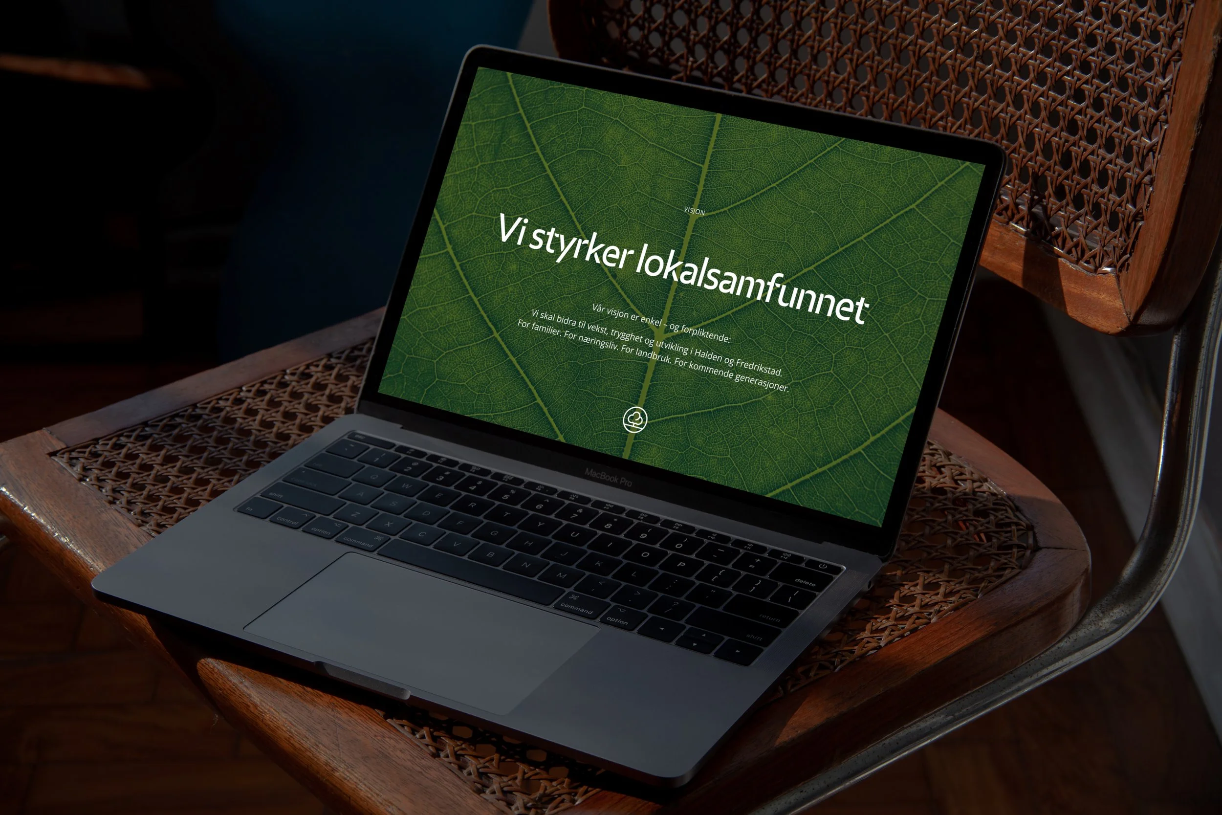
Berg Savings Bank
A modern tribute to local belonging
Services
Brand strategy
Brand history
Visual identity
Tone of voice/message bank
Photo style and photo brief
Launch plan
Painting
Berg Sparebank had a clear goal: to build a brand that reflects what the bank actually is. A local bank with long traditions, strong local roots and a genuine desire to be a close advisor – not just a provider of banking services. At the same time, the identity was to be modernized and give the bank a clearer expression in the face of both existing and new target groups.
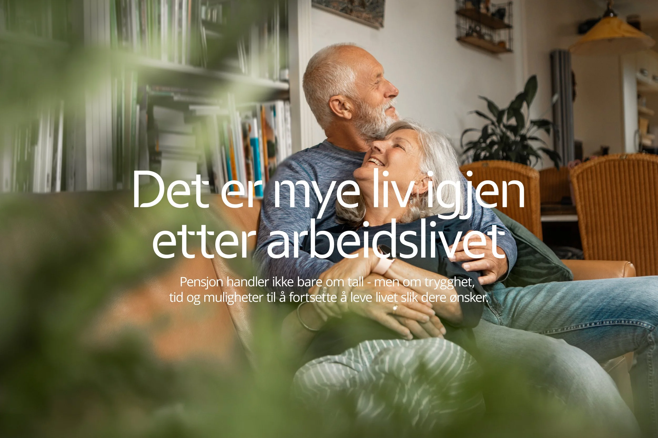
We started with insight and strategy to define the bank’s role, personality and position. This formed the basis for a new visual identity, a clear brand story and a communication concept that makes the local difference visible – both in language, design and content. The goal was to create a brand that is experienced as warm, clear and present as the people at the bank.
The result is a comprehensive brand foundation that gives Berg Sparebank the tools to communicate more consistently across all surfaces – from brand film and social media to presentations, signage and daily customer communication.
The brand film brings the bank's strategy to life. It tells the story of Berg Sparebank's role in the local community and serves as a common starting point for both internal culture and external communication.

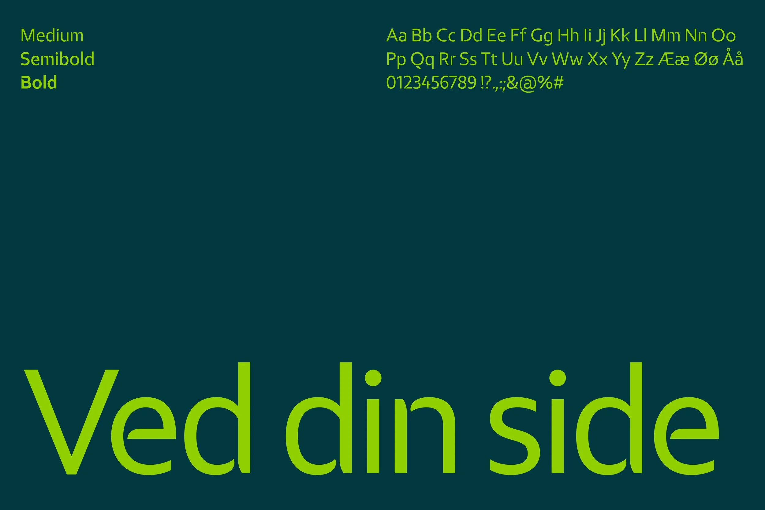
We developed a flexible design system built around the alliance form – a graphic principle that creates recognition across surfaces. The system makes it easy to build communication that is consistent, modern and clear Berg Sparebank.

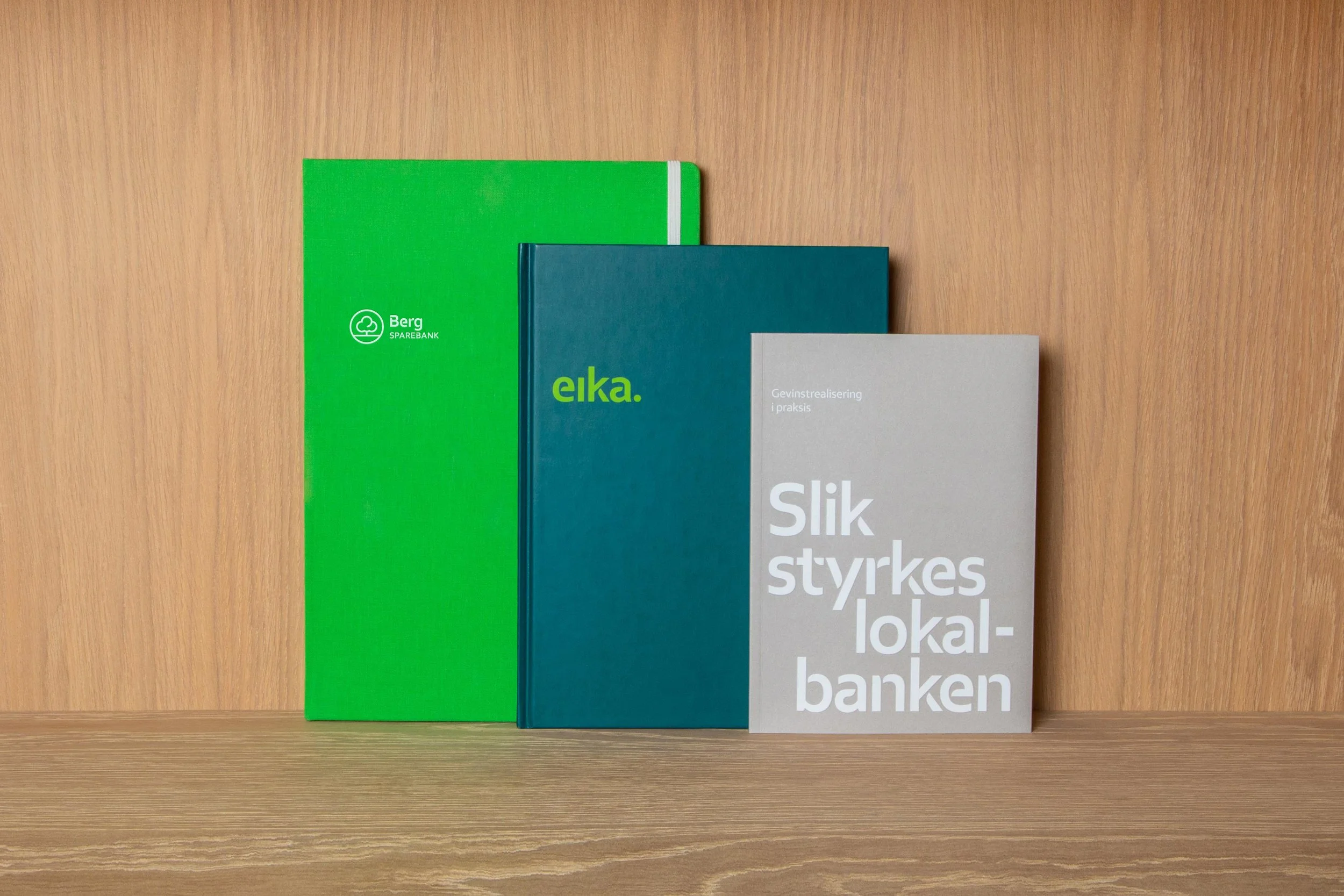


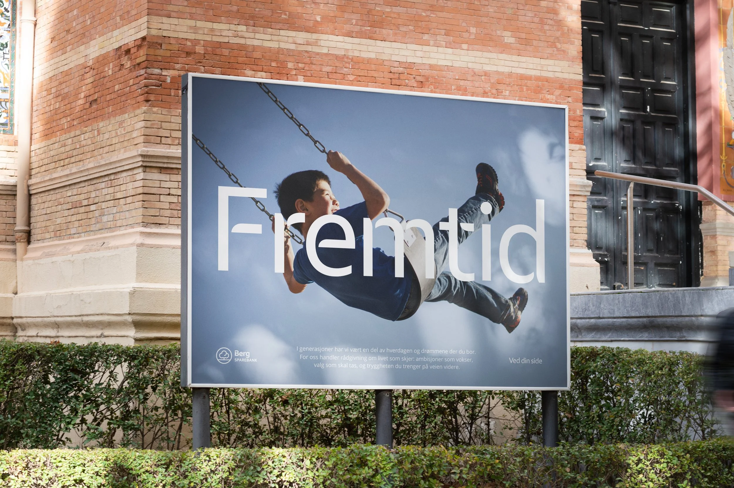

We developed templates and guidelines that make the new identity easy to use in practice. From presentations and documents to physical and digital surfaces, the solutions ensure a consistent expression throughout the organization.