Grieg Seafood - Brand identity
Creating ripples within the seafood industry
Services
Brand strategy
International survey
Brand identity
Trademark registration
Brand architecture
Web design
Communication concept
Retail
Grieg Seafood is one of the world's largest salmon farming companies, with brands in the US, Canada and Europe. In a "blue industry" where there has traditionally been surprisingly little that distinguishes players, other than the size of the company, Grieg Seafood wanted to appear more ambitious.
With a goal of taking a larger part of the value chain and being more visible, it was necessary to change the visual expression. The shift involves moving away from a solely B2B focus and charting a course towards an inclusive consumer focus in addition. The repositioning of Grieg Seafood involved a new visual identity, where the desire to convey food joy was important for the brand experience.
"The process has been both thorough and inspiring. We have experienced close collaboration where our ambitions and values have been translated into a clear, modern and forward-looking expression."
– Erik Holvik, Grieg Seafood (2025)


From small ripples to big waves
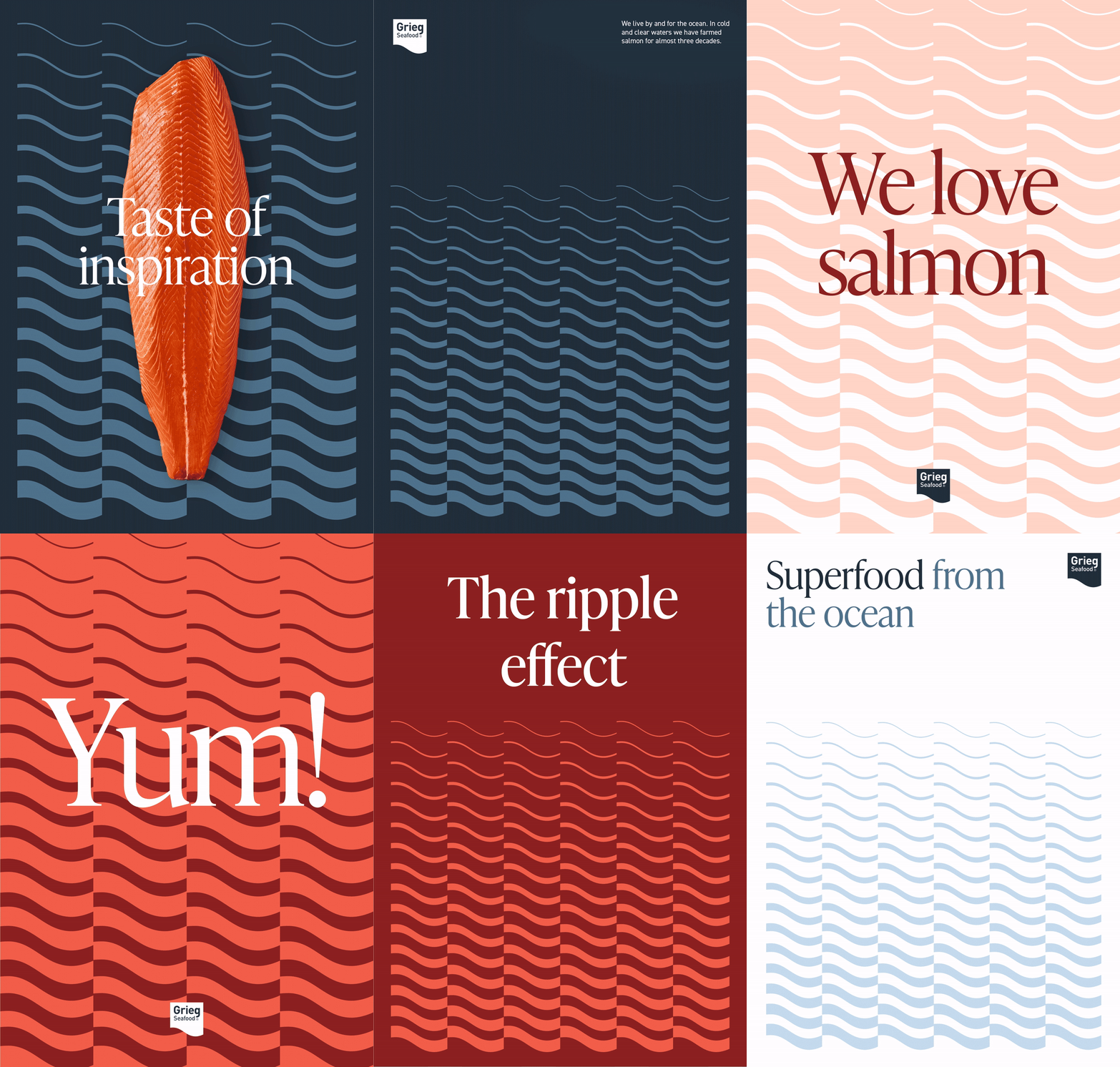
When it came to creating something new around Grieg Seafood, the focus was on the logo and especially the wave-like shape that frames it. Inspired by this wave, we developed the creative concept of the “Ripple Effect” – an idea that even the smallest changes can create a powerful, far-reaching impact. This concept became the core of a new graphic language where the symbol is not only the basis for visual elements, but also guides the brand’s tone of voice.
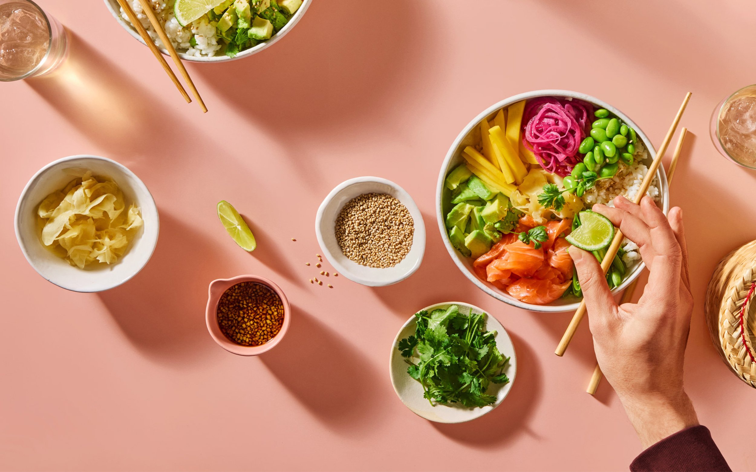
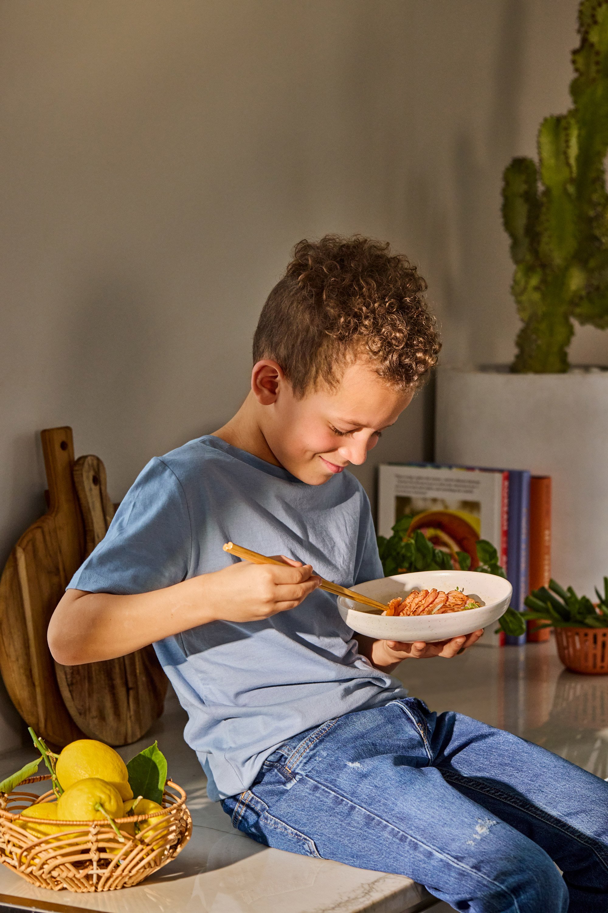
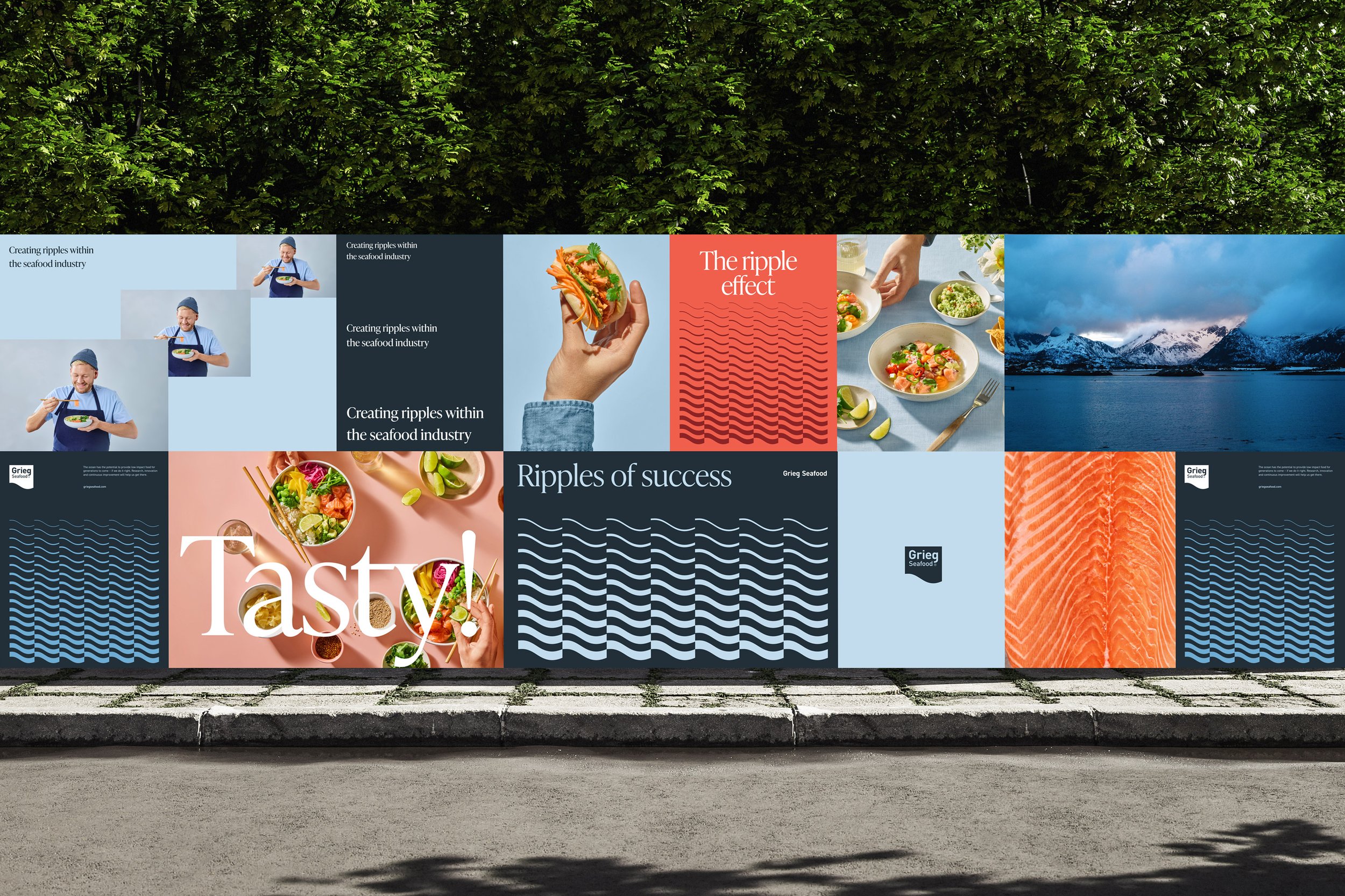
We built a flexible graphic system around the wave, creating a coherent framework for imagery and layout. The color palette was adjusted from muted tones to vibrant, confident colors, signaling a new, bold direction for the brand. To complete the visual overhaul, we shot new images, highlighting taste, human connection and the joy of food – elements that bring Grieg Seafood’s story to life in a dynamic and accessible way.


An identity that unites the value chain and the joy of food
The upgraded visual identity reflects the vision of approaching the end user, without forgetting where we come from, but embracing both ends of the value chain. With an expanded image bank, all target groups are included, and combines raw materials and food joy in a delicate and inviting way.
The color palette and typographic expression have a personality that distinguishes them from competitors and has a clear "voice". Depending on the target audience and theme, we can turn up and down the volume using contrasts and colors in accordance with a more playful and direct tone in the text and message. The graphic pattern based on the logo is used as a separate profile element where images do not fit.


"In a category where most people have the same visual language, we have a visual identity that actually stands out, and that allows us to be more open, warm and clear in how we communicate."
– Erik Holvik, Grieg Seafood (2025)


