Norwegian festival design offers mixed sweets
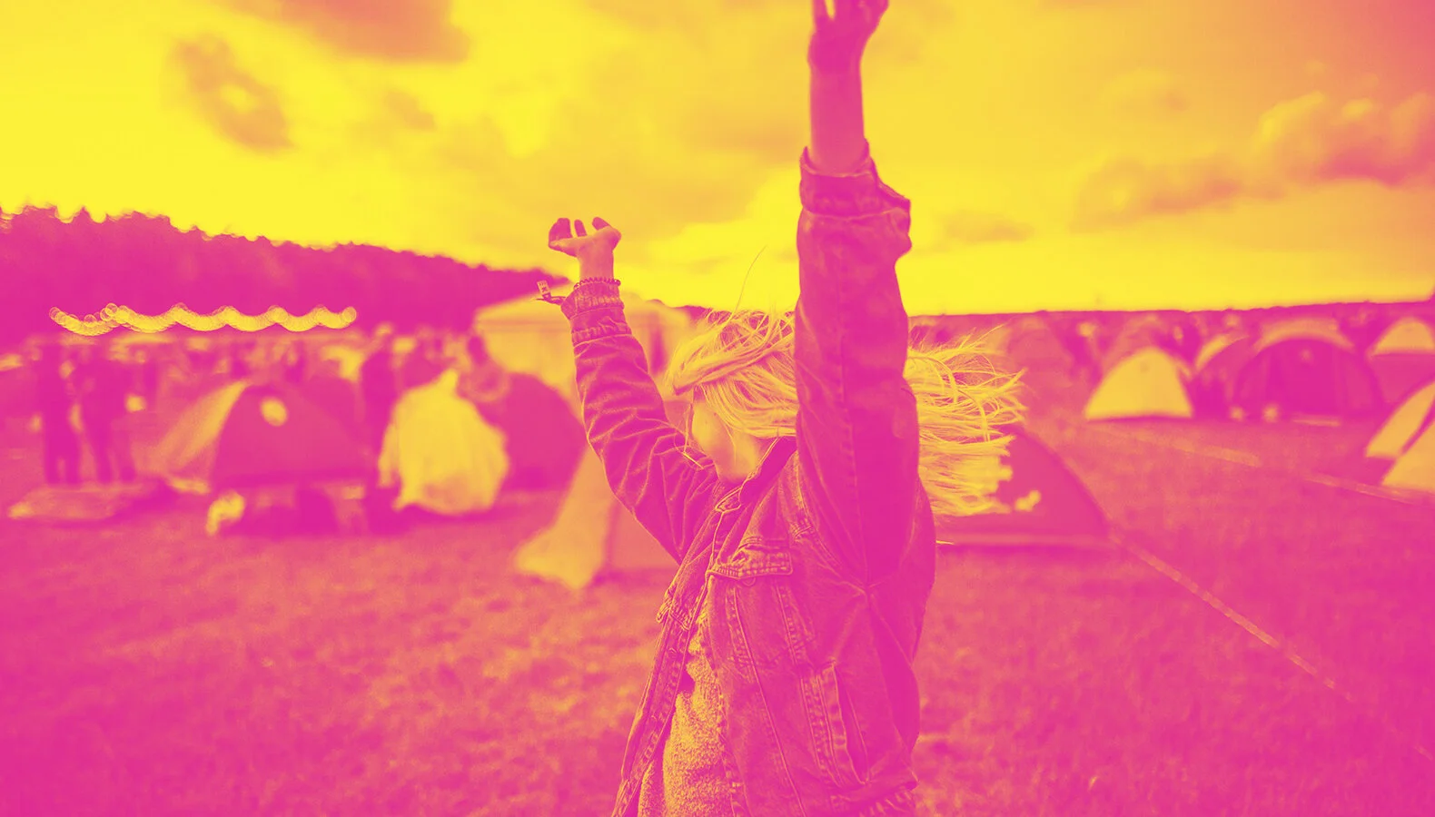
It’s summer. And for many people, this is a time when they attend festivals – no matter what. Any self-respecting town has to have its own music festival. The battle for audiences and tickets starts early, and tickets for some festivals go on presale well before Christmas. The major attractions are usually booked early on, but most people buy their tickets early on the basis of reputation and past experience.
So how come so many people decide to buy tickets that will give them access to a festival that hasn’t yet announced its list of performers? Previous experiences have a part to play in this, alongside hot trends and a bit of marketing.
Let’s have a little look at the design identity of each festival – what the audience sees before it all gets going. The design that defines expectations for the summer’s music experience.
Trænafestivalen
Trænafestivalen is a festival that’s not only sold plenty of tickets, but has promoted the area in a big way and placed Træna on the map once and for all. Paradise doesn’t have to be in the tropics . – this is the heading that greets you when you access the website. Promising. It’s exotic and different, and it defines a clear guide for the concept. It’s a good starting point, helping the site to stand out.

Trænafestivalen, exotic and different.
According to the website, "Trænafestivalen 2018 and the years ahead will focus on the ocean and the importance of preserving and protecting all maritime life", which they have also included in the design. With a global focus on ocean littering, this is an important and not least absolutely correct concept for a festival that is located right out in the middle of the ocean. Both the purpose hits the mark, and that pleases me. Unfortunately, I am not as enthusiastic about the visual execution. The design seems a bit "homemade" and simple. The small crustacean red crab, the chosen mascot, is an important piece in the ecosystem, it is said, but the execution and how it floats around a bit on Instagram and the website, do not give any positive associations. A blurry, orange illustration with a dotted pattern echoes old collage tricks and is not very successful. You have to read up on its meaning, but for those who don't know, it appears more like a pest you'd rather not encounter in your tent at camp. The color palette and image processing are complete and pleasant. The logo is apt and nice, and all communication is comprehensive and complete, which is a plus! The website is clear and works well on mobile.
I’m in no doubt that attending a music festival in these incredibly beautiful surroundings is a world-class experience, but unfortunately the design doesn’t really sell this as such. Although the design isn’t quite up to scratch, I do have to say it’s managed to give me the impression of a festival that’s honest, based on good intentions and values, and that in itself gives me an urge to head out on my boat and enjoy some fantastic music under the midnight sun.
3 out of 6
Stavernfestivalen
A lot of things have happened since Stavernfestivalen began back in 2001. Visually, it’s also made a great deal of progress from its starting point, becoming honed and more polished over the years. The organiser also balances the list of performers to attract a new, younger target group as well as people who’ve been attending the festival for many years. There’s a clear common theme in the visuals from the last few years, using the triangle from the logo in the actual communication and typography. The triangle or pyramid dates back to the start in Skråvika, where the memorial to fallen sailors in the last two world wars stands tall and proud. This memorial is shaped like a pyramid. As a designer, I can really appreciate such comprehensive instruments that are well established. But it may look as though this festival is undergoing something of a change.

Stavernfestivalen's identity has a clear common theme.
The base colour throughout was black for a number of years, but now it’s been replaced with violet shades combined with a pale pink text tone. More pop, less rock. It’s clear there’s emphasis on design, and that the quality of the design has improved over the years and become more consistent. Hurrah for that! Compared with last year, though, the overall impression has become a little more toothless and I feel it’s lacking in punch and depth. The website has clearly been designed with mobile devices in mind, and it seems a bit unfinished with a couple of obvious errors, which is a bit too late at the time of writing. But it’s more or less neat and easy to navigate, and the most important information is readily accessible. Even so, it comes across as a bit “thin”. As the festival approaches, I’d assume the website will be updated a bit more and any obvious glitches will be resolved. After all, its target group is a generation of people who usually spend all their time on their mobiles rather than interacting with reality.
4 out of 6
Piknik i Parken
Did somebody say Flower Power! A flowery meadow full of pastel shades and illustrations, happy girls wearing crowns made of flowers, and a great atmosphere. That’s my immediate impression.

Piknik i Parken invites you to carefree days in the sun.
The little festival with the big experiences . After four years of incredible progress, this festival is now well established among the big festival names. Fresh and playful. The festival that calls itself PiP , is like a big garden party organised in Oslo’s massive "garden": font goes with the festival logo – but it doesn’t bother me all that much. It’s clear the organiser is focusing on design, because it’s complete, robust and pretty good. I think the overall look is ideal, inviting people to enjoy worry-free summer days and evenings in the garden. As well as music, there’ll be yoga, activities for children, art, food trucks and all kinds of bubbles – in other words, an overall experience to delight all ages, and all the senses.
5 out of 6
ØYA
We couldn’t finish without mentioning Øyafestivalen . This is a festival that really takes design seriously. So seriously, in fact, that they’ve won a range of awards year after year for their identity. Are Kleivan has maintained a firm grip on the tiller of this festival for a number of years now (11, to be precise), and he left some very big shoes to be filled when Erland Gyllensten Banggren took over last year.

ØYA has kept its cheeky image.
Despite a change in the design, I think that this year’s look has preserved the soul of Øya, its mischievous and eclectic nature, within controlled boundaries. The layout and colour palette have been tightened up significantly, but this is balanced out by a varied mix of fonts. All the pictures of a black and white, which helps to maintain an overall strict impression. What’s left gives you a real sense of punch, rock ‘n’ roll and depth. It also appeals to a slightly more mature target group. It’s unified and communicates quality, but even so I miss some of that playful, cool and colourful aspect that surrounds a summer festival. In spite of that, this one is probably my favourite in terms of visuals, because the quality is outstanding throughout in all areas and on all media, and everything’s been well thought out and just looks great.
6 out of 6
Norway has the most music festivals per capita, so obviously competition for audiences is becoming more and more fierce every year. It’s quite possible that Norwegians have more than a passing interest in music experiences, but for many it’s probably more about the overall experience rather than just music. No matter what festival you decide to go to, you’re almost guaranteed to remember it – hopefully as a bright and cheerful summer memory.
Enjoy your festival summer!