Is your brand affected by digitalization?

Over the last few years, I have observed a continually ongoing trend of digital brands renewing themselves and, in the process, simplifying and stripping down their visual identity. Not just giants like Spotify, Airbnb and Pinterest, but smaller players, like Todoist and Slack, have also done the same.
What they and many others have in common is that they have gone over to a logo consisting of a symbol in addition to the word image, where the name is rendered in a rather neutral and “clean cut” sans-serif font. Google , which basically only has a word image as a logo, also has a symbol in the form of a G, which is, among other things, used as an app icon.
If we are to believe all these digital brands, there is therefore a need to simplify things. What can the reason be for this?

Logos before and after redesign and simplication.
Everyday digitality with digital requirements
The most obvious thing about the world we live in is that a lot of things take place on a screen and so identities also need to live on the screen if they are to survive – not just on large desktop monitors but also smaller mobile screens and tiny smartwatch screens. These small screens may also be the reason that brands see the need for a symbol as part of their logo.
What many of these brands have in common is that they are services with an associated app. This means they need to have a logo that works as an app icon and that can live along with the many, many other logos on the smartphone screen. Here, the logo needs to be instantly recognisable, and this could be the reason that many brands see the need for simplicity in the form of a symbol. A symbol is not just typically quicker to “read” than a row of letters; it is also easier to fit into a square.
The importance of the app icon could also be an explanation as to why many of these brands have used a neutral sans-serif font for the word image. For many, the app icon is the only variant of the logo that the user will see, so why spend a lot of time and resources on a word image that few people will see regardless?
Greater focus on content and user-friendliness
Another reason for this quest for simplicity may be an increasing focus on content. Many of these digital brands, such as Pinterest and Dropbox, are services that focus on content that the user uploads and shares themselves. By simplifying the brand, it doesn't get in the way of the user's content.
In addition to user content, the focus on user-friendliness is constantly increasing at the same time. A fantastic logo does not help if the service or product is difficult to use and creates frustration for the user.
As a result of content and usability becoming more important, the brand's visual profile elements are becoming less important, and therefore stripped down and simplified.
Brands are becoming more like each other
In many of these cases, the consequence of this simplification is the brands becoming more like each other. Some of the logos that have been renewed were not particularly good to begin with and it could be argued that their new logo is better (at least purely mechanically). But on the way from imperfect to newly polished, they have also lost a lot of their distinctiveness and personality.
Read about the relationship between brand, identity and branding.
In the image shown further up, it is only the logos by themselves that are compared and a logo is not the entire brand. But it is not just the logos that are becoming more like each other – illustrations (which are also becoming increasingly more popular) also have the same style among the different brands.
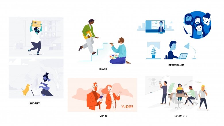
Many well-known brands use illustrations that look similar.
Simplicity need not mean facelessness
An observation of the identities that have been simplified and lost distinctiveness makes it easy to ask oneself the question; is the loss of distinctiveness simply a result of simplification?
In many of the examples I have shown here, I would answer, yes. But this need not be true. Simplicity can be found in many of the world’s most successful brands, such as Nike and Apple. Simple logos with a lot of personality and instant recognisability.
The redesign of Mailchimp last year, which I wrote about before Christmas , is a good example of a brand that has simplified elements of its brand (logo and symbol) without losing personality. Simplicity does not therefore need to mean facelessness.
“I would like to encourage designers to look more carefully at what makes a brand unique, before simplifying it just for the sake of simplicity.”
– Espen Benoni
Some companies choosing to go in the opposite direction
For every trend we find a countertrend. At the same time as many brands are modernising and simplifying their identity, others are going back in time and using their own history and tradition as inspiration for a new identity. An example of this is Kodak, , which launched a “new” logo and identity in 2016 that was based on its classic K symbol of 1971. Or Tiger of Sweden , which went further back in time to get back some of what was the company’s spirit before.
I think many brands are being smart by simplifying themselves. It is also positive to see that brands are focusing on user-friendliness to a greater extent than before. We have experienced websites or apps that confuse and frustrate more than they help – we don’t want to go back to that. At the same time, we must be allowed to ask ourselves whether digital requirements steal away some of the uniqueness of the individual brand. I would like to encourage designers to look more carefully at what makes a brand unique, before simplifying it just for the sake of simplicity.
Read more about how to create a brand identity in an ever-changing world.