Rebranding of Equinor, Uber and Mailchimp
I started as an intern at Mission in August 2018. After completing my internship, I was offered a permanent position here as a junior designer, and during the fall I have had the opportunity to work on many exciting projects. At the same time, I have been able to see what is happening outside the office, in the design world. This year, like last year, new brands have emerged, while several established brands have become new. Here are three well-known brands that have undergone a rebranding.
Three well-known companies with a new identity
Equinor
In March, Statoil announced a strategic shift from being an oil and gas company to becoming a broad energy company, and changed its name to Equinor. In this context, they've received help from Superunion for the naming and the development of a new visual identity.
Statoil's old logo and the new one of Equinor.
The new logo, like the old Statoil logo, is composed of a word and a symbol. The star symbol lives on but is simplified and literally reversed on its head. The grading and the 3D effect are gone, but there is something about the symbol that just isn't right. The biggest "prism" in the star is far larger than the others and makes the symbol appear top-heavy, almost so it should fall over. It doesn't have the same balance the old Statoil symbol had.
In the "minimisation process", Statoil / Equinor also loses much personality, both in terms of symbol and wording. Gone is the characteristic Statoil fountain ( Designed by Magnus Rakeng in the Milky Way, whom we've interviewed earlier ). The new fountain falls into the series of geometric sense serif fonts that have established themselves as a clear trend in recent years. The R is what makes the wordmark unique, but at the same time it steals too much of the attention from the other letters. This is particularly visible on Equinor's websites,where the font is used throughout.
The logo has a fresh red colour. Most people may encounter the new identity on a banner or sportswear, in a sponsorship context. Much thanks to the red, the logo is clear and works fine. But overall, unfortunately, this identity doesn't quite nail it for me . The colour ensures good visibility, but the style is unfortunately a bit dull and the symbol lacks balance. Read more about the rebranding from Statoil to Equinor here.
Score: 3 out of 6
Uber
Just two years after the company got a new identity, Uber has again renewed itself. It's the British agency Wolff Olins, who, in collaboration with Uber, with its own design department, is behind the new identity.
Uber's logo before and after rebranding.
At first glance, this does not look like the most exciting rebranding, but after reading about the background for the identity, I became fascinated by how Wolff Olins, in collaboration with Uber's own designers, have guided the identity process. Through collecting user data, they found that there was a desire to keep answers and invest in the wordmark rather than a symbol. There were probably also many who "wondered where U had gone off to".
"What we learned: 1. Let in the light, embrace black, 2. Invest in a wordmark, not a symbol, 3. Bring back the U"
Most of the colours have been stripped away and replaced with black, which gave positive associations to the brand, according to research Uber did themselves. In one way or another, Uber is black, and it seems that the identity manages to take ownership of the colour (if you can call black a colour).
The logo is a clear improvement from the old one. Also, in this identity, it's a geometric sense serif font, but the U has got a tail (like a minuscule u), which gives the logo an ever so small touch of character. This is a good example of a particular detail that doesn't interfere in a disturbing manner (as in Equinor's case), but rather slides into the whole.
The bland old app icon (which in its time got a lot of criticism ) has been removed and instead the new logo–the wordmark–is used. Uber writes on their pages that by investing in the wordmark as a logo they no longer needed a symbol.
It may not be the logo in itself that is the most exciting with the new identity, but the context it lives in. The rules that are defined for composition of elements, such as images and typography , are flexible and functional, as opposed to many other ambitious branding projects.
Uber's composition guidelines, based on the shape of the "U", give room for flexibility.
Many may think this rebranding is rather boring, but it's a clear improvement over the old identity, I think. The method behind is very fascinating, and the result is undoubtedly a step in the right direction for Uber.
Score: 4 out of 6
Mailchimp
Mailchimp is one of the world's largest online marketing services in the form of automated campaigns and email newsletters. This is by far the most splendid rebrand of the year. Here is an identity that dares to be different, and in a positive way as such. The American agency COLLINS is behind the identity.
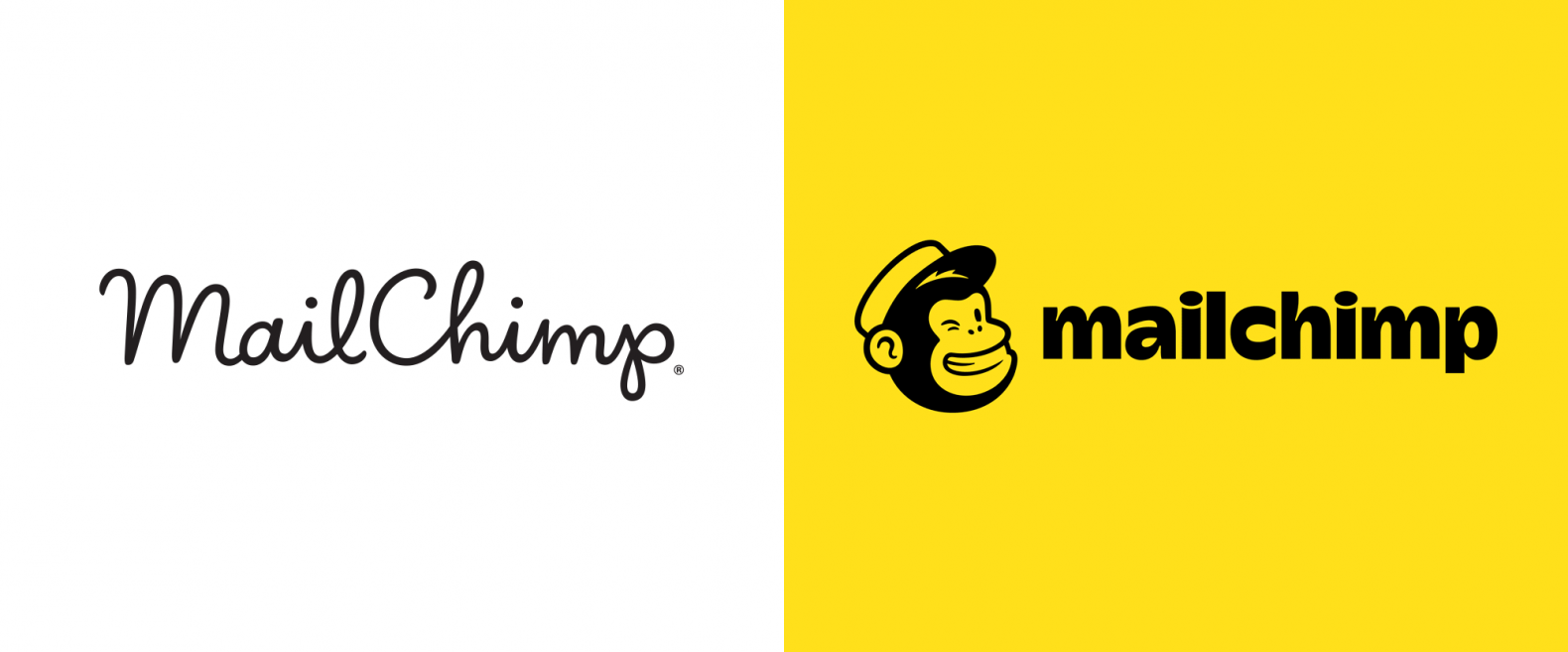
Mailchimp's logo before and now.
Mailchimp’s mascot–the monkey– has long been an important part of the identity, but has remained independent. Now it has got space in the logo as a symbol, and it has been simplified at the same time. The monkey is still as recognisable, but now scales better to smaller sizes. In the wordmark, Mailchimp has gone away from the handwriting and used a playful and expressive sans serif font, which sits well with the symbol.
Where more and more identities use modern sans serif fonts (as in both of the identities mentioned earlier), Mailchimp goes in the opposite direction and uses Cooper, a font originally designed in the 1920s. A surprising choice for a tech company like Mailchimp, but in this identity it's like another layer of personality and works excellent.
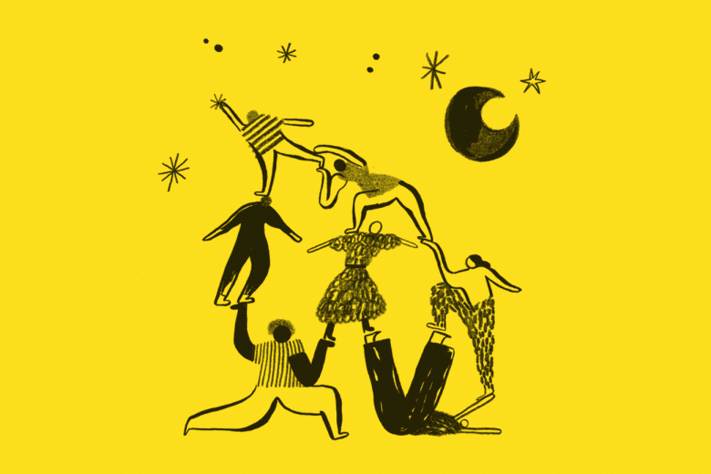
Along with the energetic colour palette of yellow and black, the illustrations are an element that really draws attention to the new identity. Unpolished and playful hand drawn illustrations give a distinctive character that takes the identity to new heights. The fact that some of these are animated will be the icing on the cake.
The playful illustrations are a hightlight in Mailchimp's new identity.
The combination of colour, typography and illustrations result in an energetic, exciting and well-executed rebrand. This is how it should be done! For more, check this out.
Score: 6 out of 6
Maximise your potential!
There are a number of reasons for companies to rebrand, both compteley or more gradually and discreetly. Some companies change name for various reasons, others change strategic direction and aim at new target groups. Others also need a lift to be seen as relevant again. Regardless of the reasons they have, it is important to carry out a thorough evaluation of the situation and the reason for the rebranding so they are not at risk of wasting the potential already at hand within a strong brand.


