Hedda Hytter - Brand identity
The Renewal of a Norwegian Classic
Services
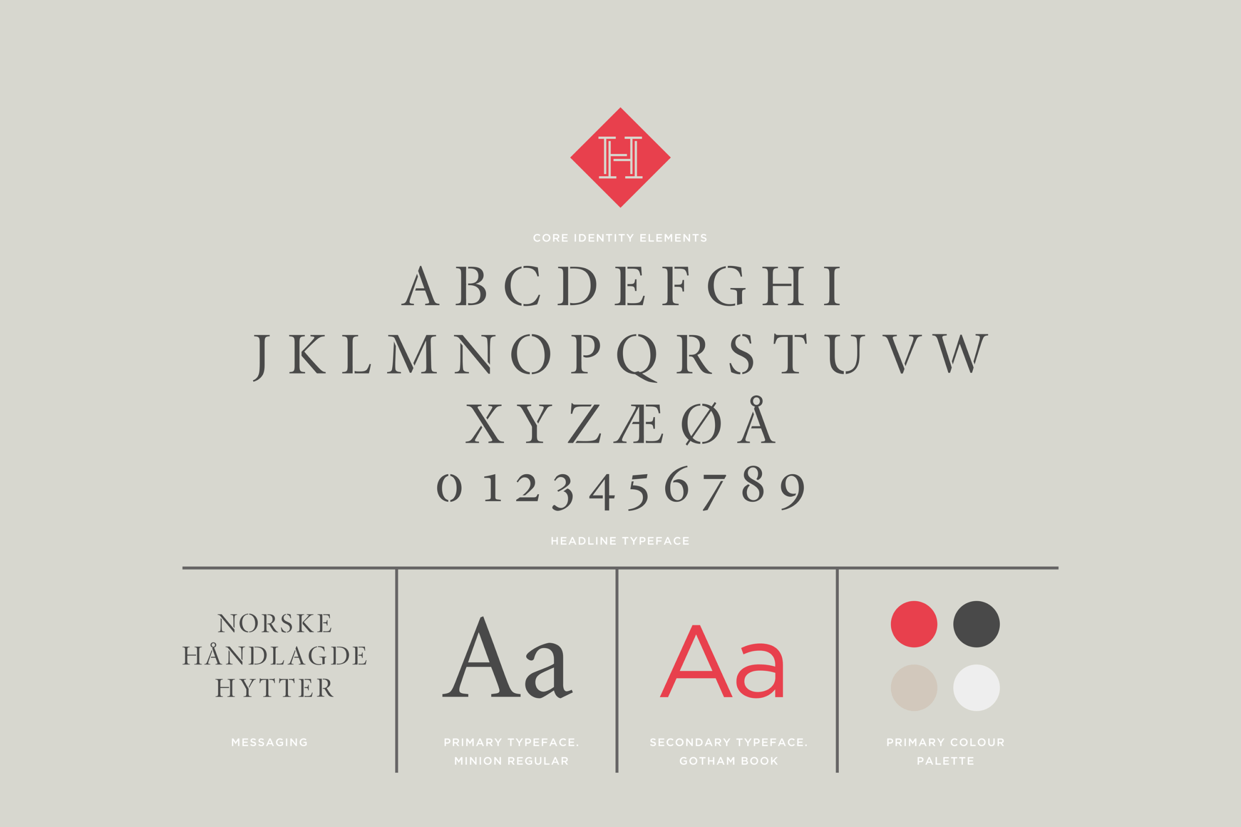
In 2012, Mission started the job of repositioning Hedda Cabins. We primarily wanted to find our way back to Hedda's original DNA. We wanted to know why Norwegians so desperately want to live out the cabin dream. We developed a new identity with a logo designed as a monogram and with the H as a symbol. Hedda's H is made up of several elements, much like the cabins are.
Challenge
The fellas behind the Hedda Cabins have set up cabins since the crank phone and the days of blue paper, so it goes without saying that a lot has changed in the company since then. One of the most significant changes occurred in 1990 when cabin architect Jon Haug was hired to develop a new element system for the cabins. His holistic thoughts about cottage life formed the basis of the company's philosophy, and the success did not wait. The cabin, with its unique proximity to nature, was launched at just the right time. Unfortunately, after several successes, Hedda gradually lost both focus and market share. The market changed, and competitors appeared in abundance - and they were aggressive!
Solution
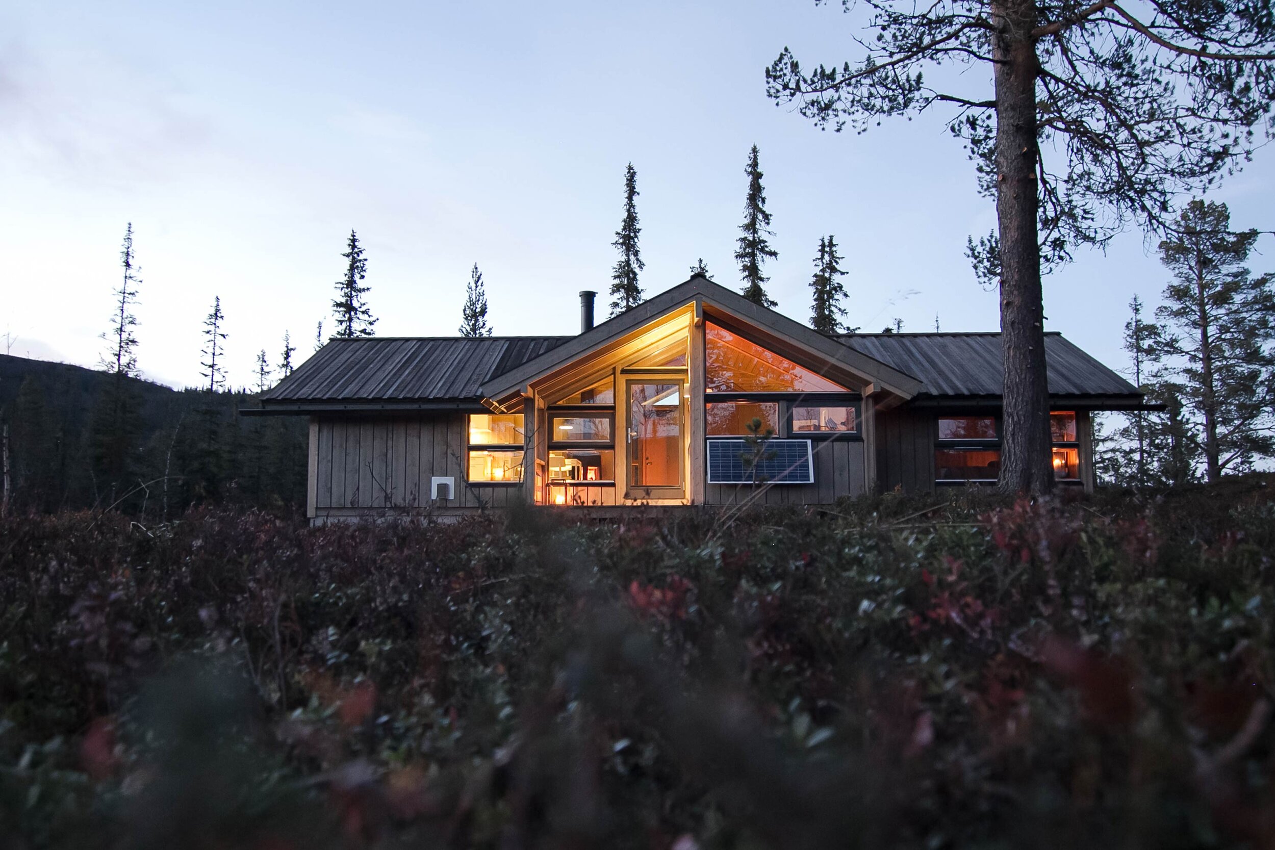
Much of the identity of Hedda Cabins can be well explained with Norwegian words that begin with H: Hedalen (Hedalen), Haug (Haug), hytteliv (cabin life), hyttedrøm (cabin dream), helgetur (weekend trips), hygge (cosiness), helhet (wholeness), håndverk (craftsmanship) and historie (history). Video and photos are among the main elements of the new identity. The new picture style reflects life in the cabin - under the communication concept: HAVE A GOOD WEEKEND!
In a tough competitive market, it was essential to find a unique concept and position. The goal is not to take quantum leaps, but to be innovative and modern within a cabin tradition that Hedda Cabins have a great respect for - and are a part of.
Result
We launched the new identity in the winter of 2013. The strategy has been, among other things, to position Hedda Cabins in the minds of potential customers with design as a preferred parameter, when buying a cabin. New concepts such as sports cabins and design cabins have been met with great enthusiasm and curiosity in the market. The new identity not only gives a shift towards a more extensive customer base, but has also created a sense of pride in the areas where Hedda is produced - in Hedalen, Skjåk and Suldal. Hedda Cabins has received great feedback from both existing and potential customers. The new catalogue has been in great demand, and there has been a good increase in catalogue inquiries via the web and social media.
Delivered
Brand platform
Tone of voice
Graphic profile
Photo bank
Signage
Brochures
Promotions
Presentations
Sales Literature
Supplies
Our approach was to modernise the brand without losing its original DNA. A crafted new monogram was created as a quality mark representing the build quality of the product. And new photography inspires those considering investing in a cabin and the unique lifestyle that comes with it. The new brand identity has been implemented across all channels, including: print, video, events and social media.
Thanks to
Art Direction: Kjartan Haugen
Photo: Bjørgli / Bergersen
Styling: Kråkvik D'Orazio


