SiO – Brand Identity
With the Student at the Core of Everything
When the Student Community in Oslo (SiO) and Oslo- & Akershus Colleges student community (OAS) merged into one organisation, the purpose was for all students in Oslo to receive equal and best possible welfare services. A united student community represents more than 60,000 students. This means that the students can have a significant influence on public authorities.
The challenge was to create a unifying identity that both student organisations could recognise as theirs. SiO consisted of 13 different business areas that acted as SiO's representatives in the outside world.

“Mission gave us the platform and the tools we needed to manage our brand. Even though new platforms and surfaces are emerging, we see that our profile works everywhere.”
— Thorstein Diesen, Graphic Designer SiO
(2021)


Challenge
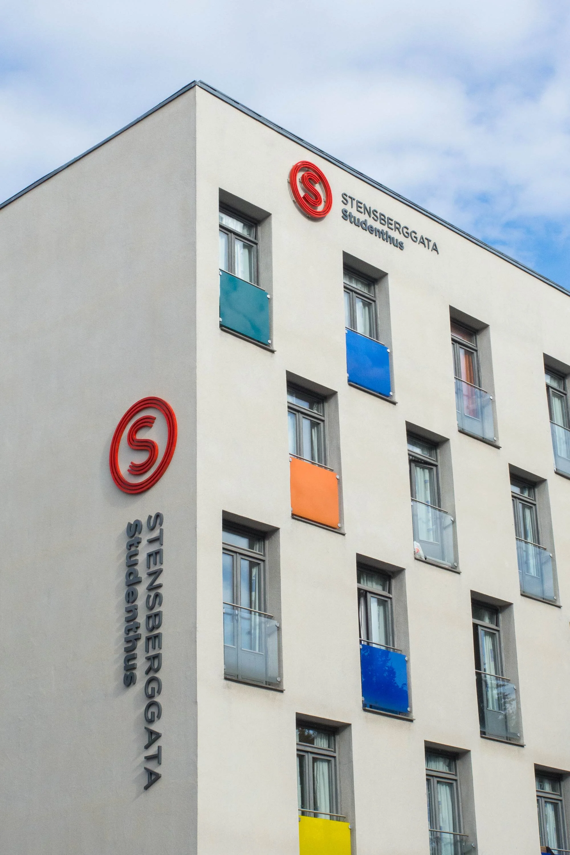
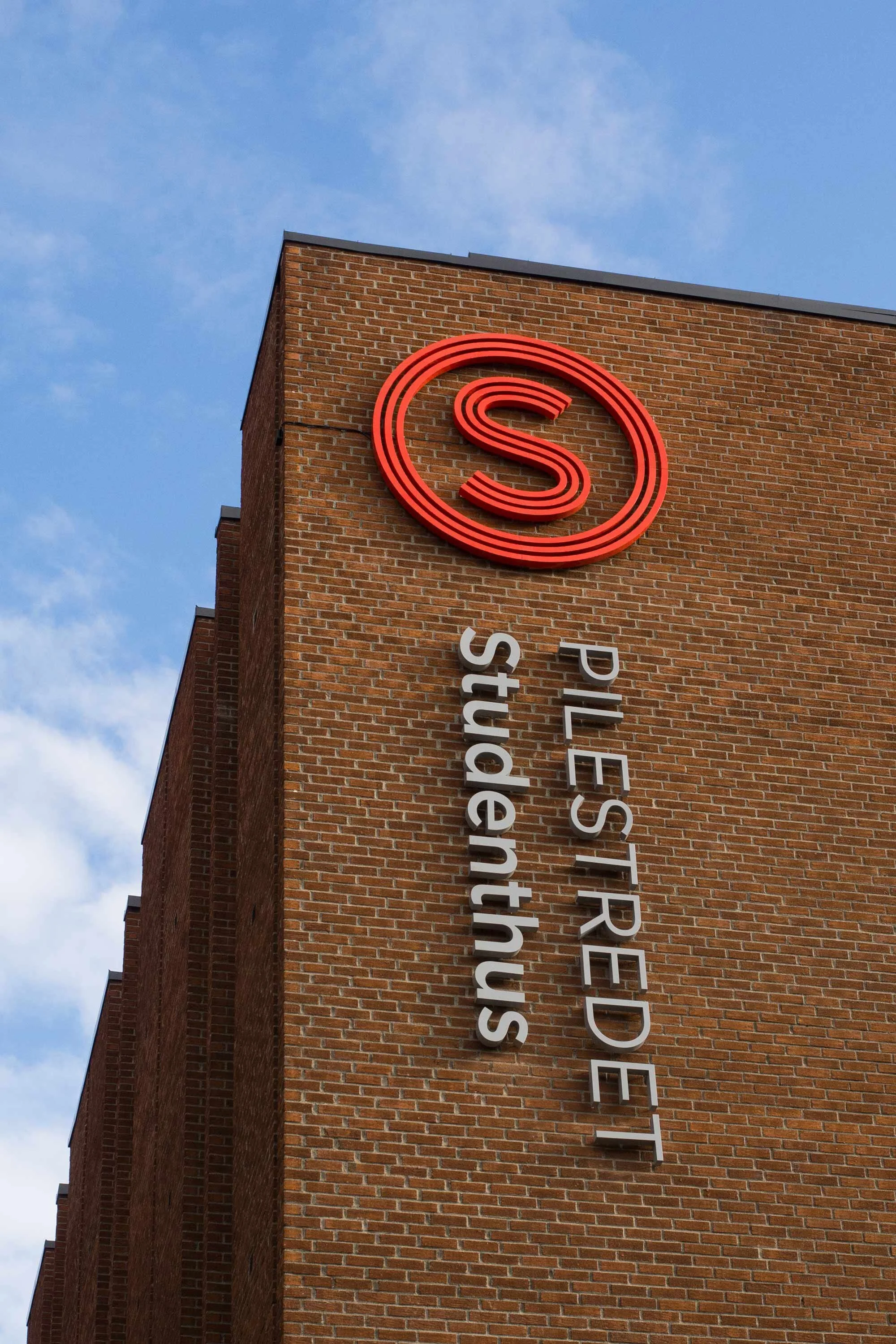
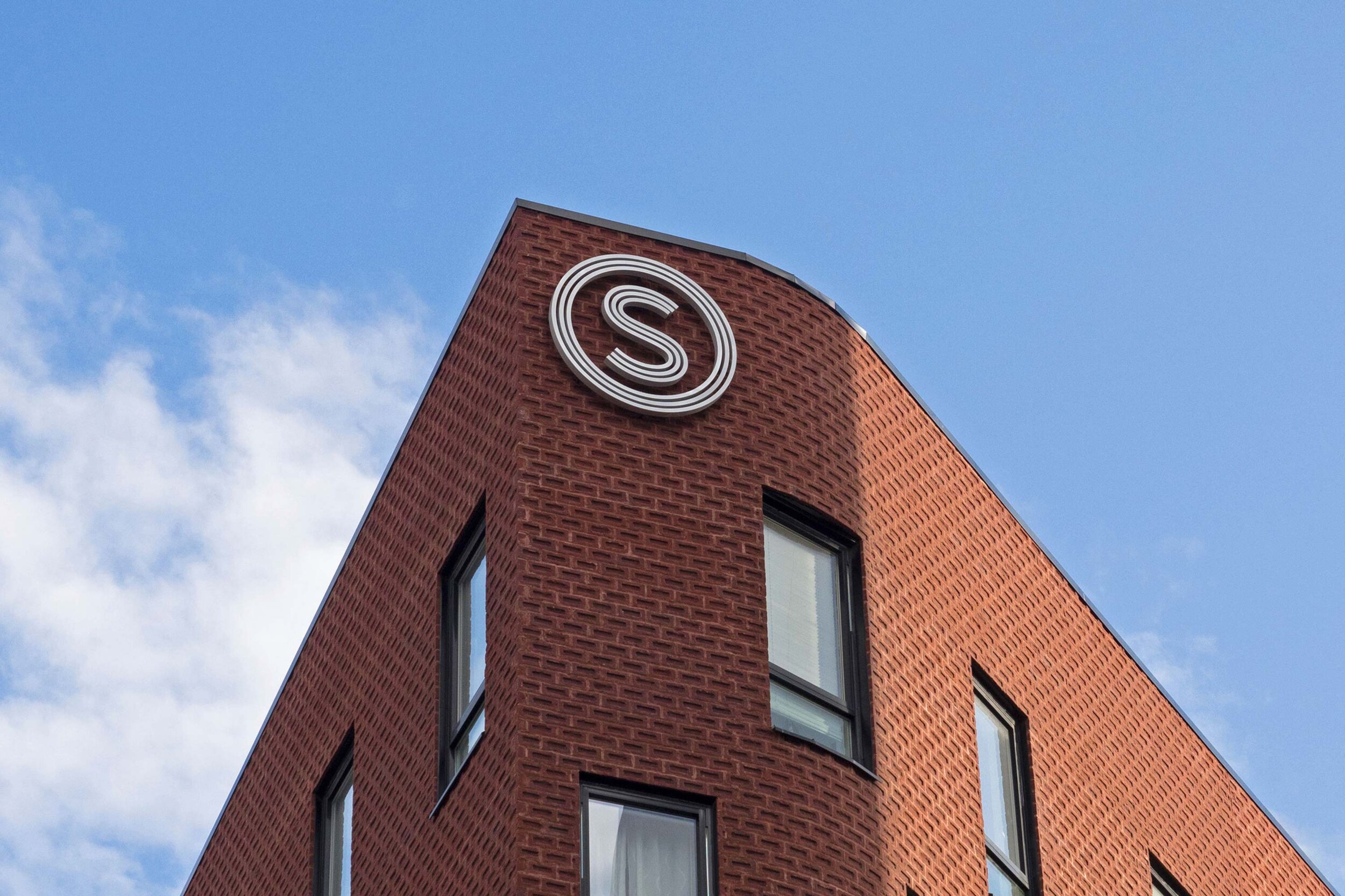
The logo and profile-colour is strong and simple, the logo shows a S-i-O, meaning an S in an O in Norwegian. The 3 rings in the symbol wrap a ring around the student/community in the middle.
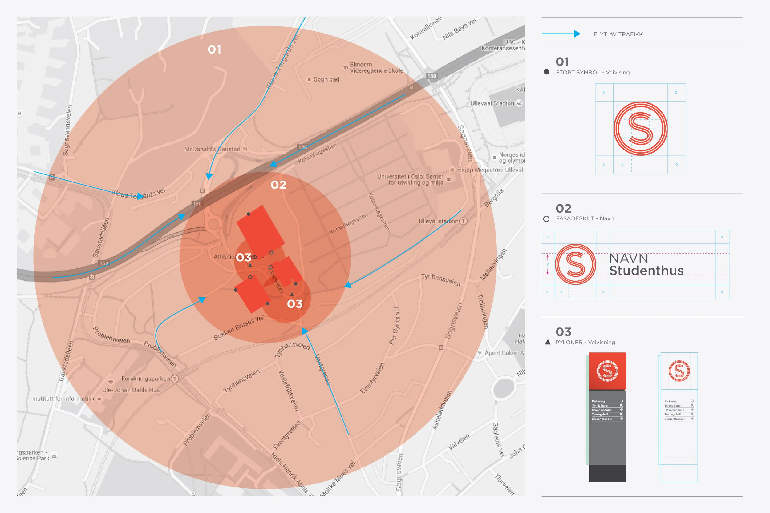
With the merger, the number of members and buildings increased significantly. When more than 60 000 SiO member move from reading rooms to canteens, gyms and their own homes it is essential to have good and clear signage. Many of the student housings are scattered around the city, and with many students who are new in town, SiO wanted to be a clear sign in the cityscape, as well as a safe haven in everyday life.
Solution
The identity is built around using the symbol as an icon for the student community. Therefore, the image style had to capture familiarity, originality and sparkle.
Mission was honoured to help create solid concepts and brands for more of SiO's businesses, including SiO Athletica (new name and concept), and the Deiglig identity (bakery on campus).
We developed an extensive sign system to make navigation as easy as possible at different radiuses. With the symbol placed at the top of their buildings in a large format, SiO takes clear ownership of the location and at the same time signals from a long distance that "we are here". This becomes a lighthouse in the city's jumble of streets and buildings for a student who is lost. When you get closer, the facade sign with the name of the building will let you know that you have found the right place. When the distance radius becomes shorter, the signage becomes more detailed and informs, among other things, about the locations inside the building itself.
Result
This was a merger with grand results.
The identity and sign system have been created with the student in focus, to make students' everyday life easier. The symbol acts as a natural guide in the cityscape. As a result, SiO as an organisation has received a much greater degree of recognition. But best of all, staff and students feel pride and natural ownership of the identity!