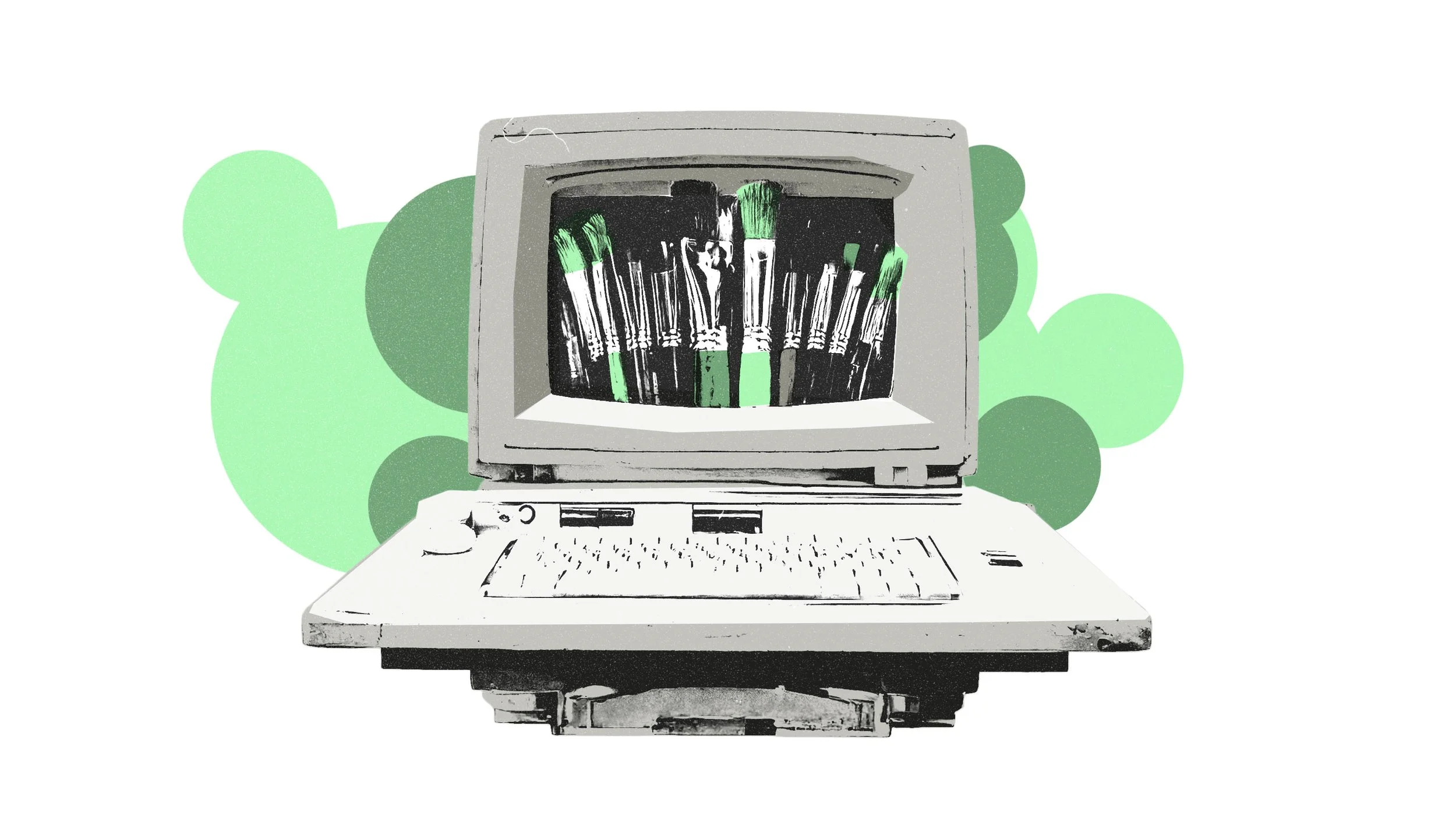
Tips from Magnus Rakeng about font design

In order to understand the effect a font can have on a brand and what lies behind creating good fonts, we have had a chat with Norway's most credited font designer, Magnus Rakeng.
Typography and choice of font are central elements in everything to do with graphic design, whether this involves magazine design, web pages, books or posters. In addition to ensuring legibility and clear communication, good typography contributes aesthetically and provides distinctiveness and individuality. This particularly applies to identity design where the choice of font is involved in colouring the visual language in a strong manner.
A chat with font designer Magnus Rakeng
In order to understand the effect a font can have on a brand and what lies behind creating good fonts, we have had a chat with Norway's most credited font designer, Magnus Rakeng.
What is your everyday work?
I often work with logos, word images and typography related projects. But most of the time I work on identities, album covers etc. But I have actually just been working on a stamp project.
Are you working on any font projects at the moment?
No, a long time often goes by between font projects because many many people aren't aware of how much work is involved. As a general rule, it is only the biggest companies that seek advice on this. And we don't have very many of those in Norway, of course.
“I price a great number of jobs that never come to anything.”
How do you price a project like that?
The prices are often based on an estimate of the number of hours required. That is why it is important to have a clear brief and order. Once the price has been set, we keep to this, unless something very unusual occurs. Nevertheless, things often take more time.
Why do people create their own or new fonts? And what do you think, for example, the Telenor font has done for the Telenor brand?
Despite being extremely legible, the Telenor font provides distinctiveness and great recognisability. In an advert, for example, you don't need to see the logo to realise who the originator is. Combined with the colour, you see immediately that it comes from Telenor.

In addition, you make sure that no one else has the same font. You own the rights. This is one of the most important advantages in having your own font. Different trends come and go when it comes to fonts and typography. Designers often fall in love with the same fonts and then you quickly end up with many having the same typographical feel and then the trend gradually dies out. With an identity, you are often looking a bit further into the future.
What do you think is important in a specially created brand font?
It is important to be able to achieve a form of distinctiveness without this affecting the legibility too much. You need to remember that it will be in use for a good while and must withstand the ravages of time and influences of new trends.
If you become too preoccupied with making the font unique and exciting, you run the risk of the font itself detracting attention from the message. Then you have gone too far. But, if you are too cautious, then you might as well use a font that already exists.
“You need to ensure that the identity will be just as relevant in five years time or longer.”
Together with Eika we created a font with a lot of distinctiveness. How do you feel it works in practice?
The Eika font is basically as so-called display font that should mainly be used for titles and introductions. But what is interesting is that the visual effects, which are rather clear and graphic, diminish and become more gentle in tandem with the point size at the same time as legibility is increased. For this reason, it can actually stand up to being used in slightly longer texts when it is not too big.
How should you go about having your own font created?
It is important to think through what you want to achieve and how many weights you need. Does it need to work in every language? Will it be used in small body text as well as in large headings? It is important to discuss this and many other questions with the designer who will be carrying out the job.

How much time do you spend on a font like this?
Creating a font is an elaborate and time-consuming job. That is why many people are surprised when they find out what it costs. For example, we were working with Avinor for several months before we were finished. This included every possible character to cover every language and three weights. This was a big project. With Statoil, we had nine weights, including italics and small caps. In addition, we created a separate sign weight to ensure good legibility at distances.

This job was done in stages. For example, italics came later. Some are not optimal and can make things expensive. It pays off to create all weights and versions together. This makes the process simpler and quicker - and usually more reasonable.

Magnus Rakeng
Is one of the Norway's most credited font designers and is behind some of Norway's best known brand fonts, including Avinor, Canal Digital, Statoil and Telenor.