Eika - Identity
A Driving Force for Growth and Development for You and Your Local Community
Eika Alliansen's purpose is to be a driving force for growth and development for its customers and local communities. Customers should feel that the bank cares about them and the places that they live in. Mission came up with three short words to express the essential idea of what Eika is about: “Ved din side” (By your side).

"Mission had a professional attitude to the task and listened to us. Not least did they convince us with their broad design expertise and extensive experience."
Ole Rølvaag
Director of Marketing, Eika Group
(2021)
Delivered
Naming
Brand Identity
Brand Architecture
Web Design
App design
Signage Program
Interior concept
Sales Literature
Image Bank
Presentations
Fire film
Challenge
The financial crisis caused difficulties for many companies, including Terra Group – a financial institution owned by, and in alliance with nearly 80 local banks. The need for change generated positive initiatives throughout the banking alliance, one of which was to review the brand. The decision was made to change the identity with the aim of emphasising the alliance’s role, reflecting its close partnership with local banks, customers and the growth in their local communities. Mission was chosen to develop a new brand identity for the alliance.
Solution
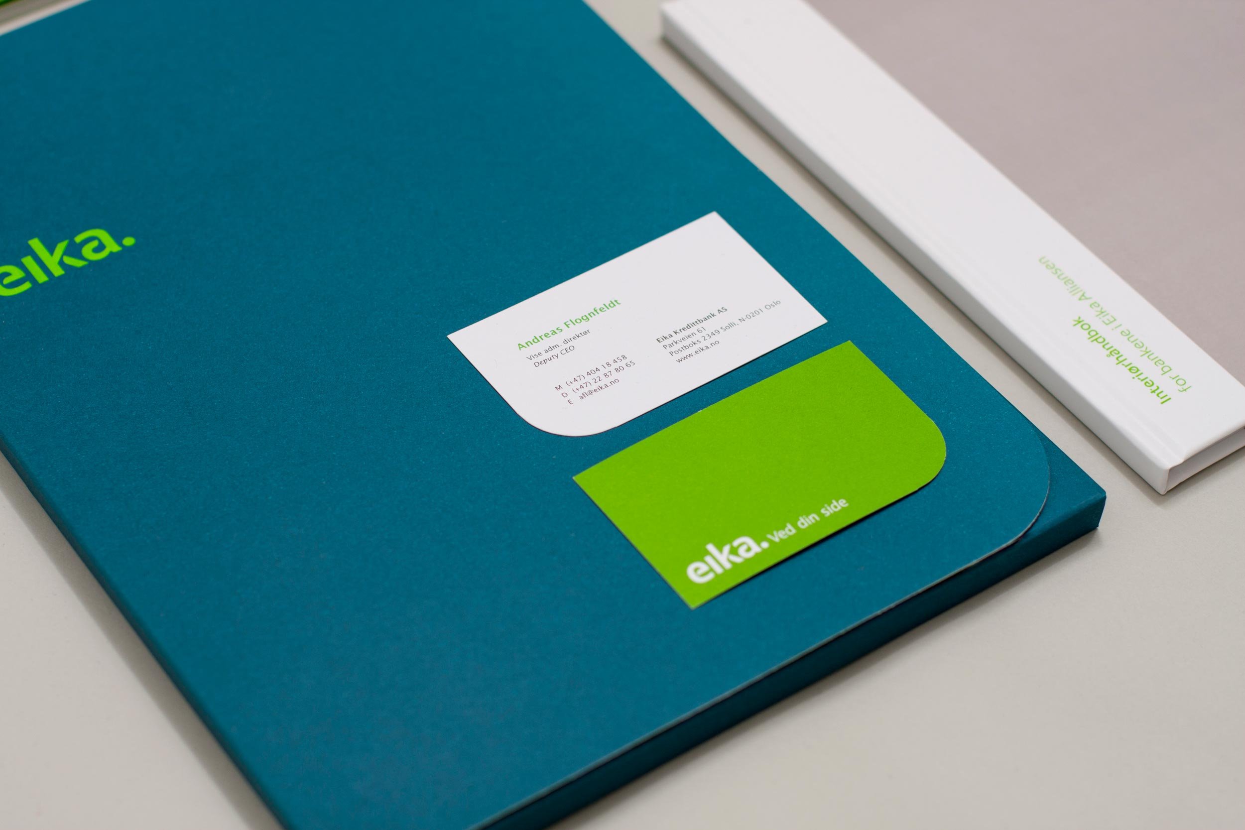
Close examination revealed that the name and position of the alliance was associated with large banks and did not reflect the close partnership between the local banks and their customers. Therefore a new name was introduced: ‘Eika’ (The Oak), an icon with a long tradition in Norwegian savings banks, and a friendly symbol that signals long-term financial strength, customer orientation and growth.
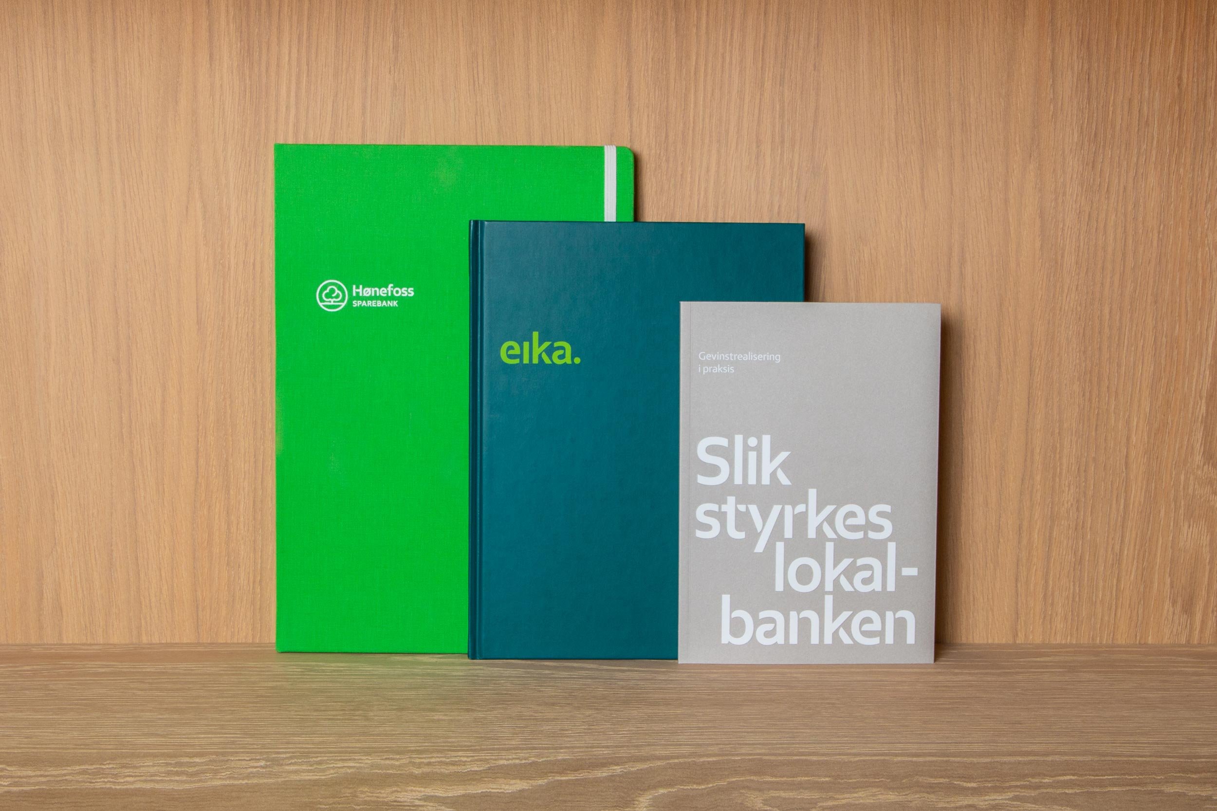
We developed a new identity program for both The Eika Group and The Eika Alliance banks. The identity works to distinguish the alliance while still supporting local banks and local brand names. All main contact points were redesigned, including signage, product literature, internal communications and websites, so that the alliance provides a consistent experience in the physical and the digital world.
Result
The success of the new brand depends on the consistent utilisation by the members of the alliance. The fact that nearly 80 banks have adopted the brand is an incredible compliment to how the change process has been conducted.
The change to Eika has already strengthened the position of the banks in their communities, and the brand Eika shows a very positive development in the Norwegian Kundebarometer omdømmeålinger after the first year. In Norwegian Familieøkonomis last survey to identify banks in Norway with the best terms, eight of the top ten banks belonged to the Eika Alliance.