Sporveien – Brand Identity
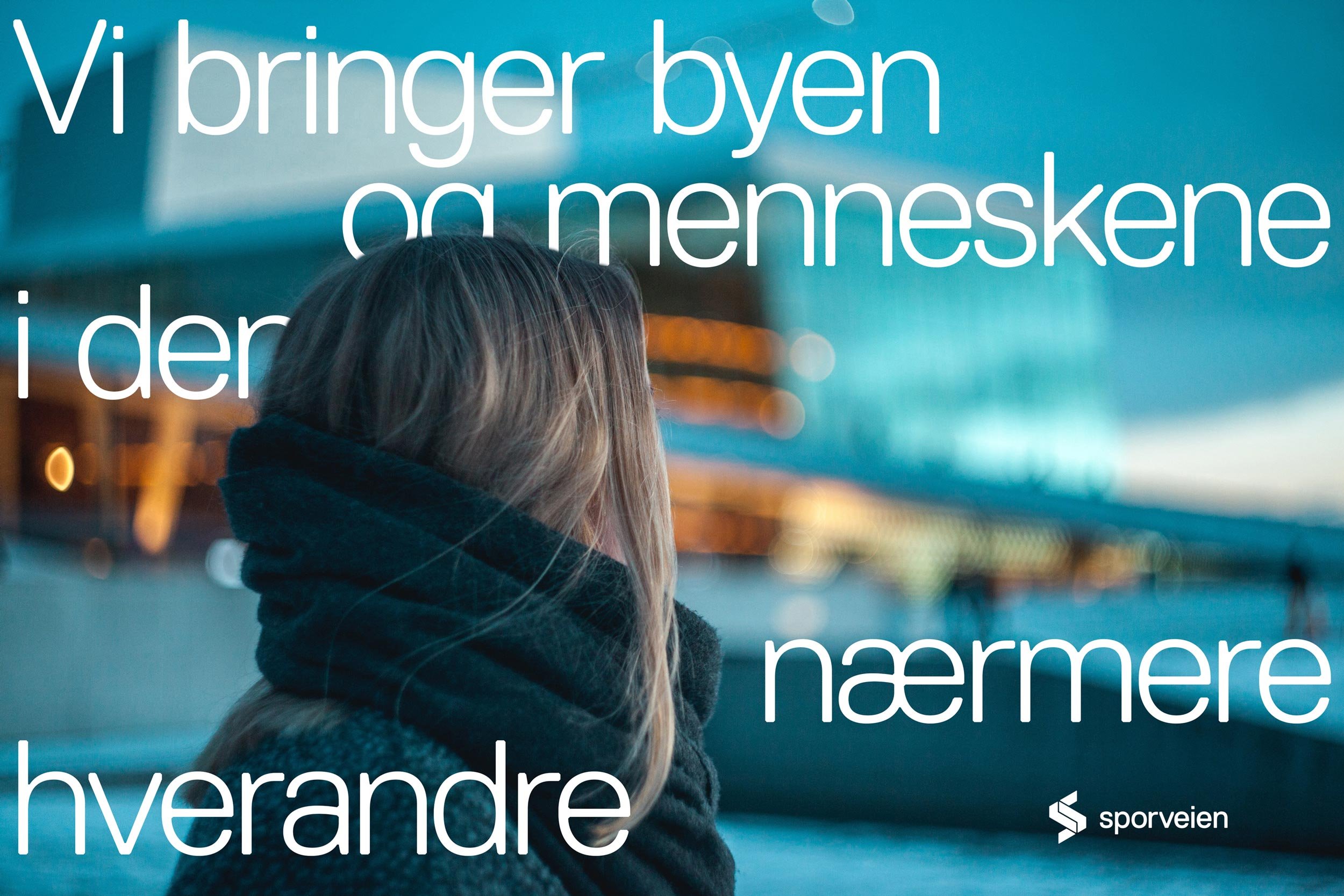
Bringing People and the City Closer Together
Services
Sporveien plays a key role in the development of Oslo and the old Akershus. The city depends on Sporveien to provide quality public transport to become the sustainable and modern capital we want it to be. With this as a starting point, Sporveien has an increasing need to communicate more, and to a broader range of target groups, from politicians to potential travellers.

« With the new logo and brand, we have managed to establish a completely different visibility than we had before. It has also contributed to building a very strong and good culture internally within the company. This has been crucial for us to be able to succeed with the strategic goals we have had as a business in recent years. »
Torgeir Kristiansen
Executive Vice President, Communications and Society, Sporveien
(2021)
Challenge
A few years ago, Kollektivtransportproduksjon had more than 4,000 employees, several different subsidiaries and was relatively invisible as a brand. There were several reasons to begin to think differently. Mission helped them in the process of changing their name to Sporveien.
Once the name was decided, they needed a clear, distinct, and unifying profile that could help increase awareness in the market - a robust, modern identity to position Sporveien as the essential contributor to the society they are. The profile should also enable the recruitment of new competent and motivated employees, while being flexible enough to meet the growing communication needs.
Solution
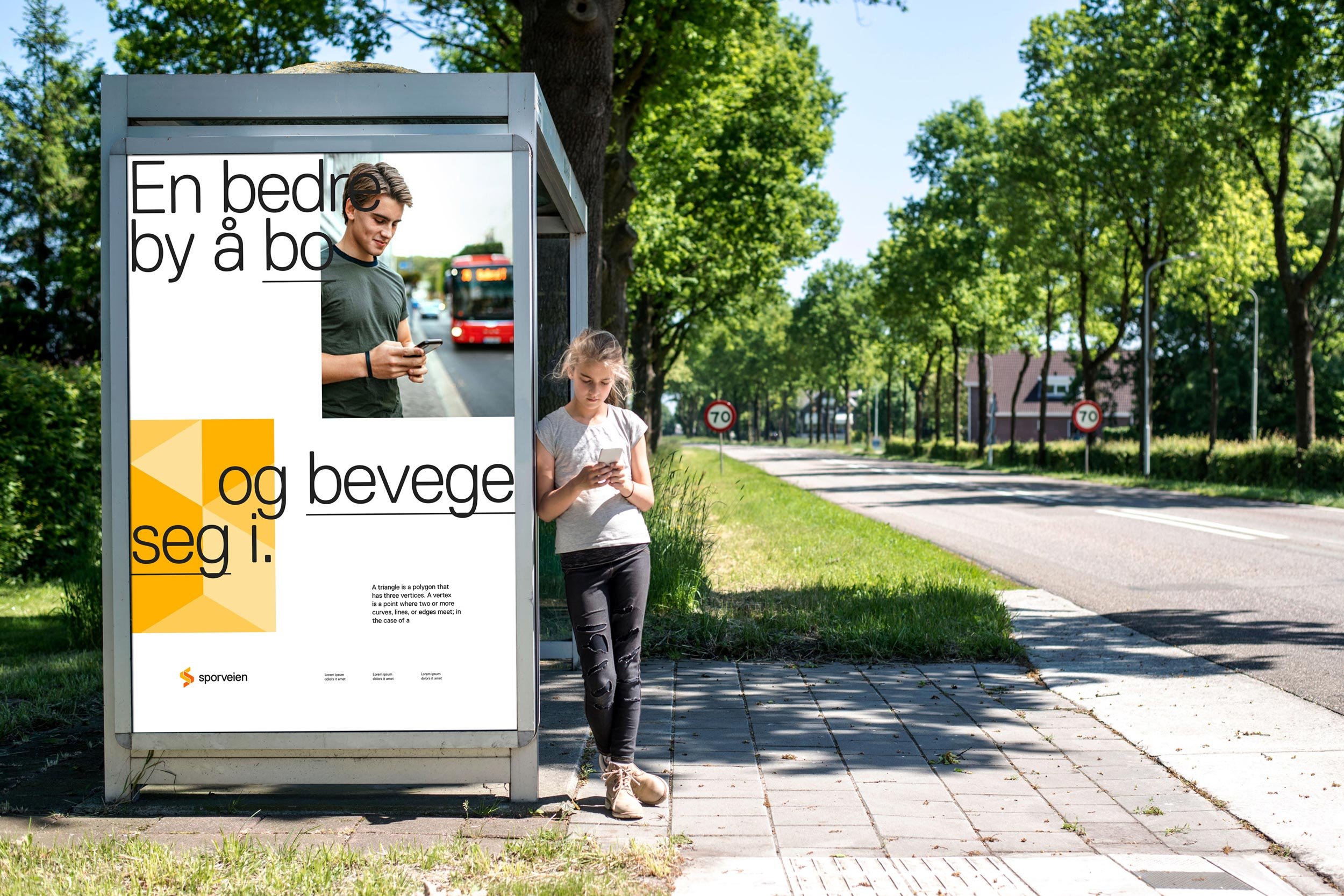
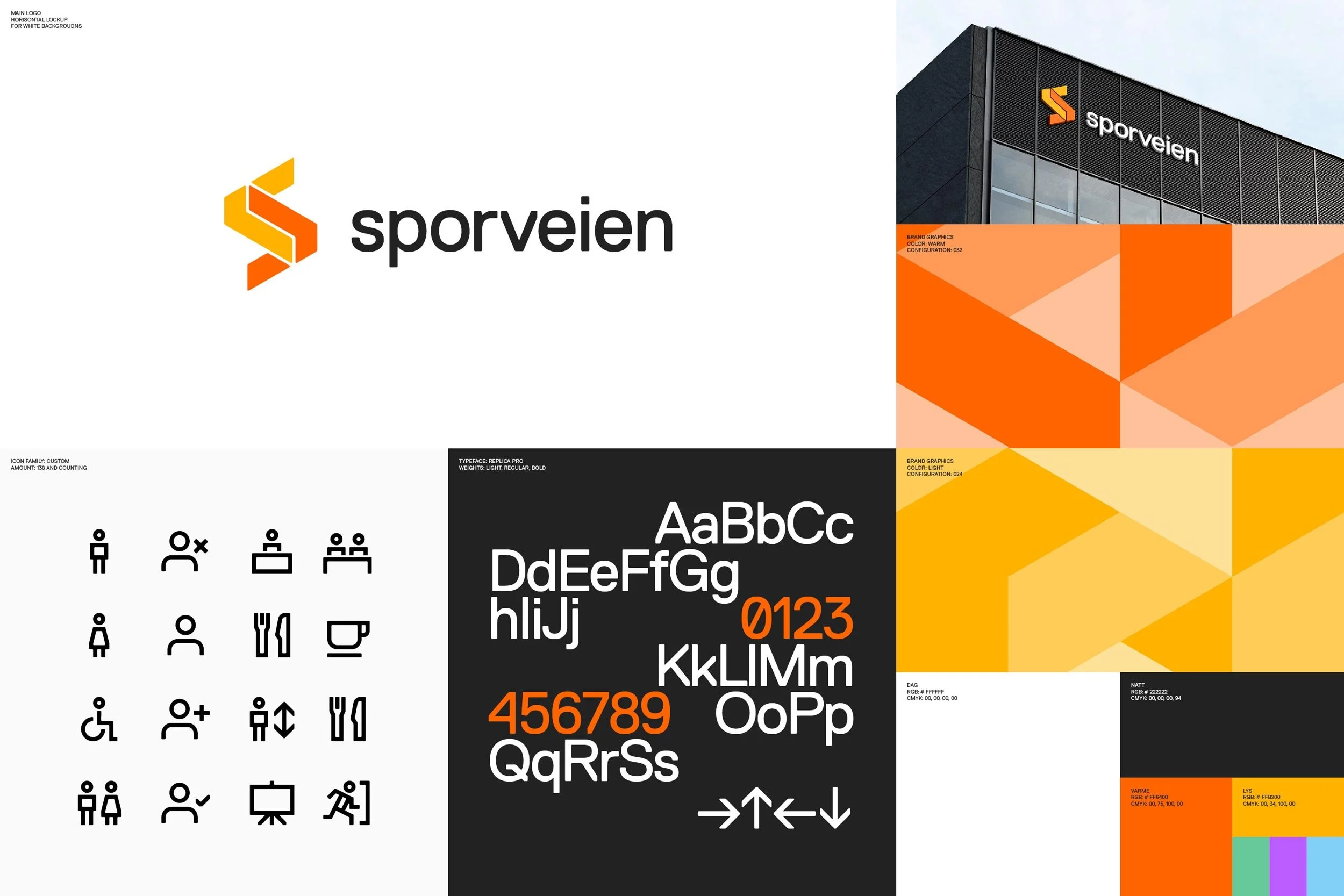
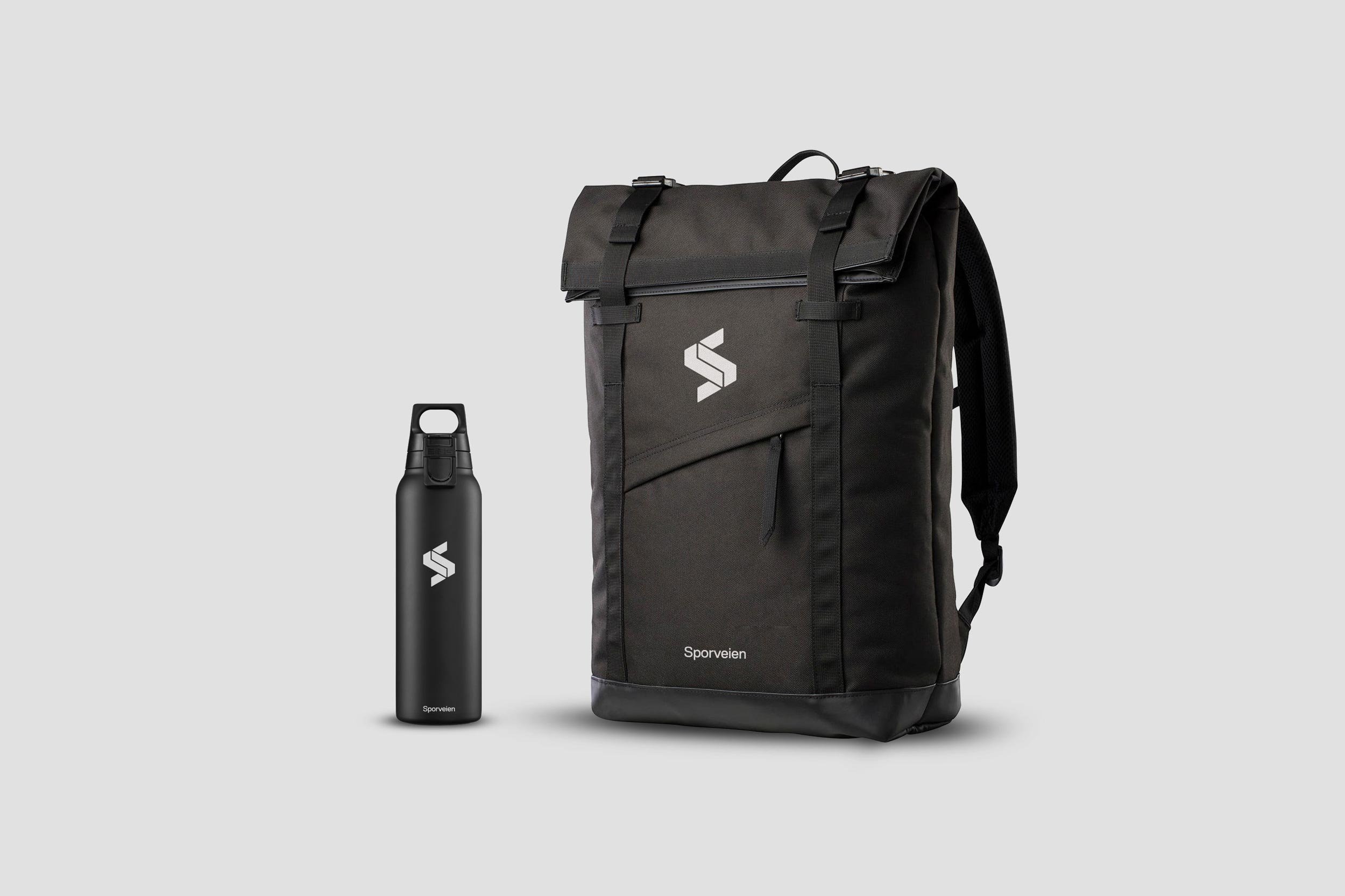
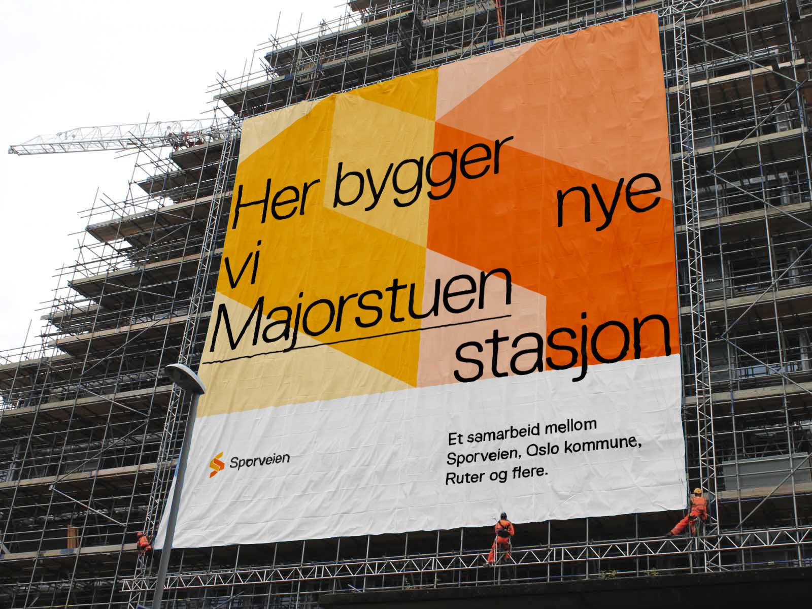
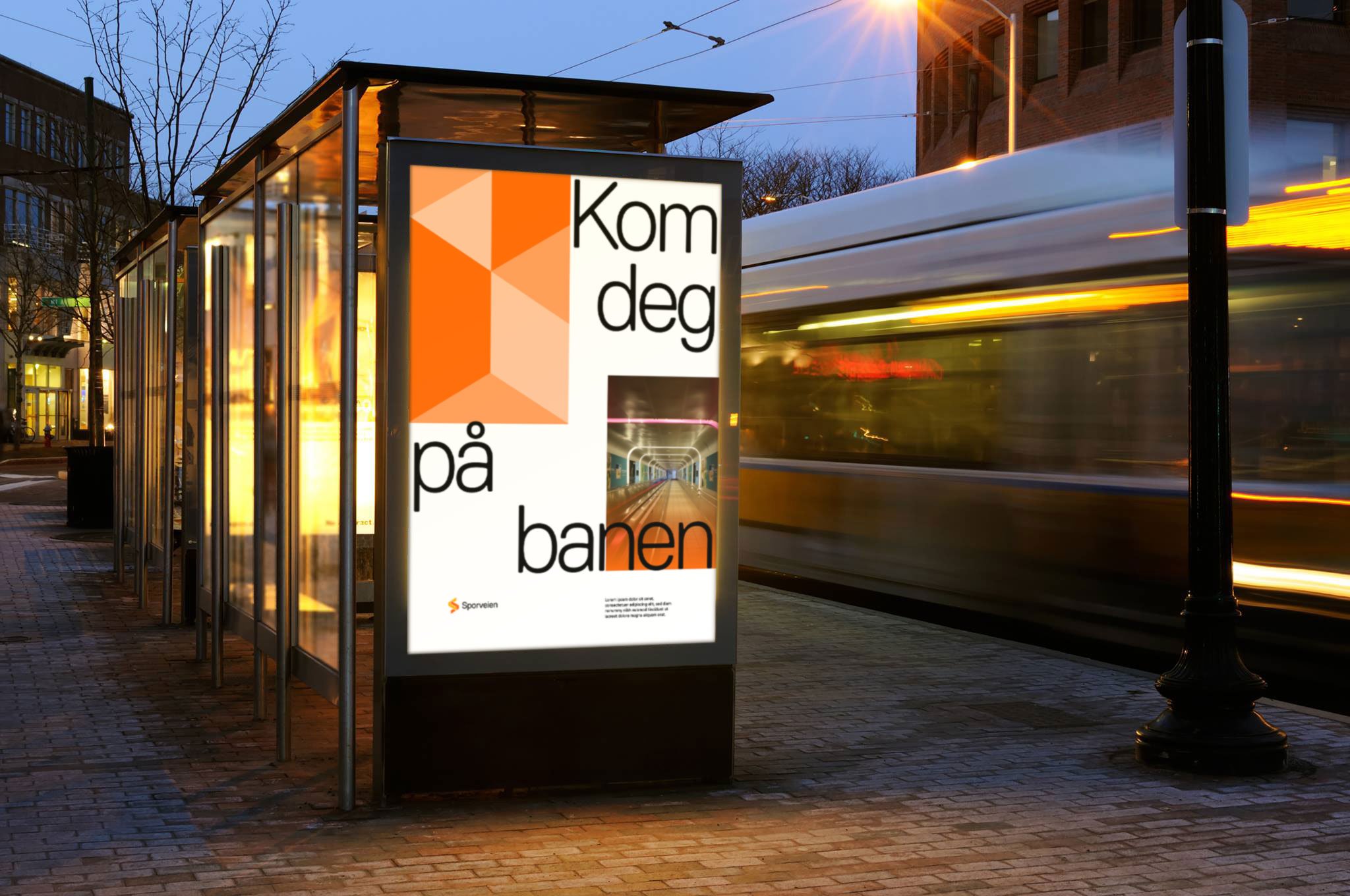
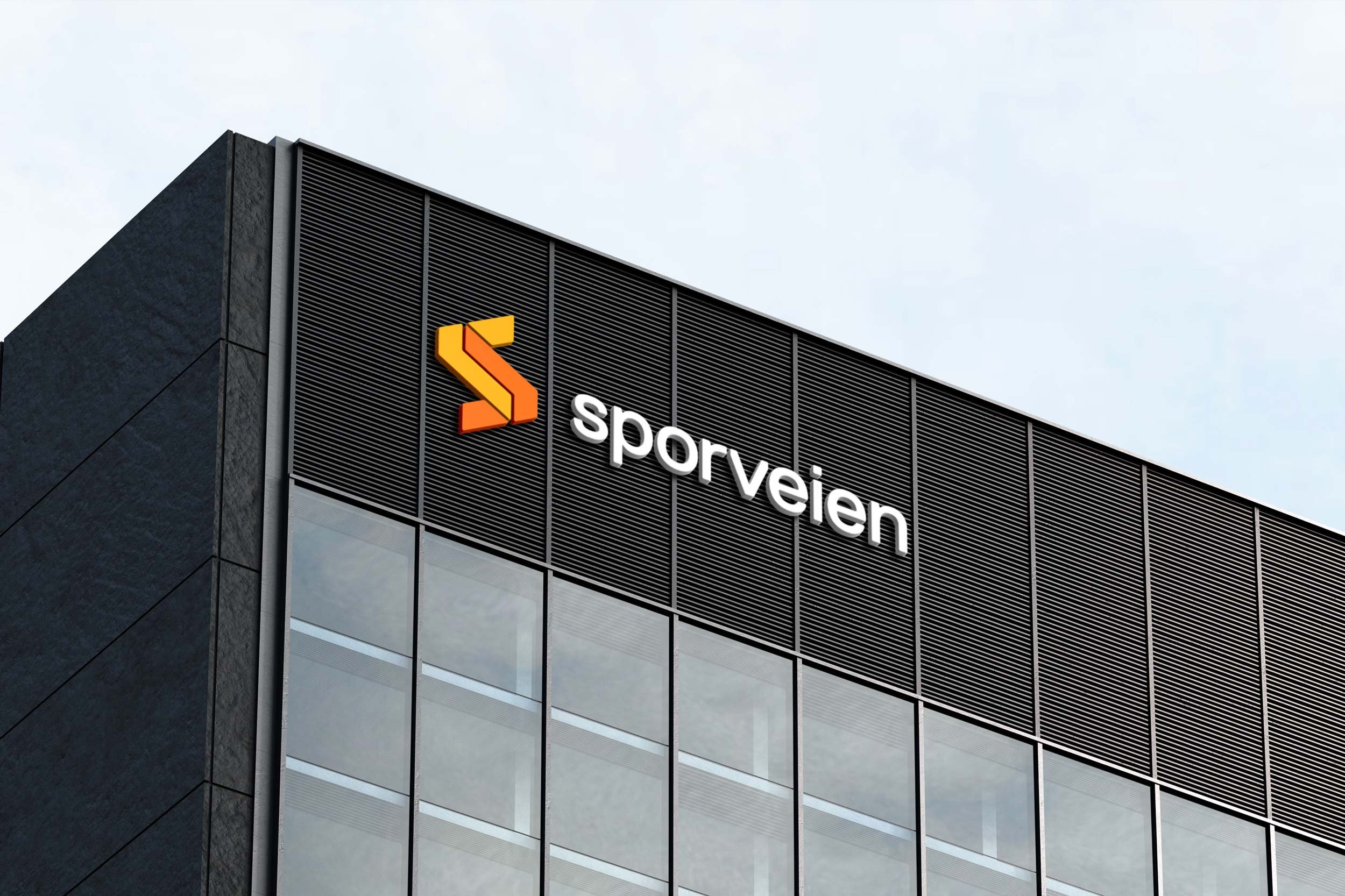
"We bring the city and the people closer together" is the idea behind the symbol in the logo. The two arrows come together to form an S. The shapes communicate movement, communication, transport, and links, and lay the foundation for the complete identity system.
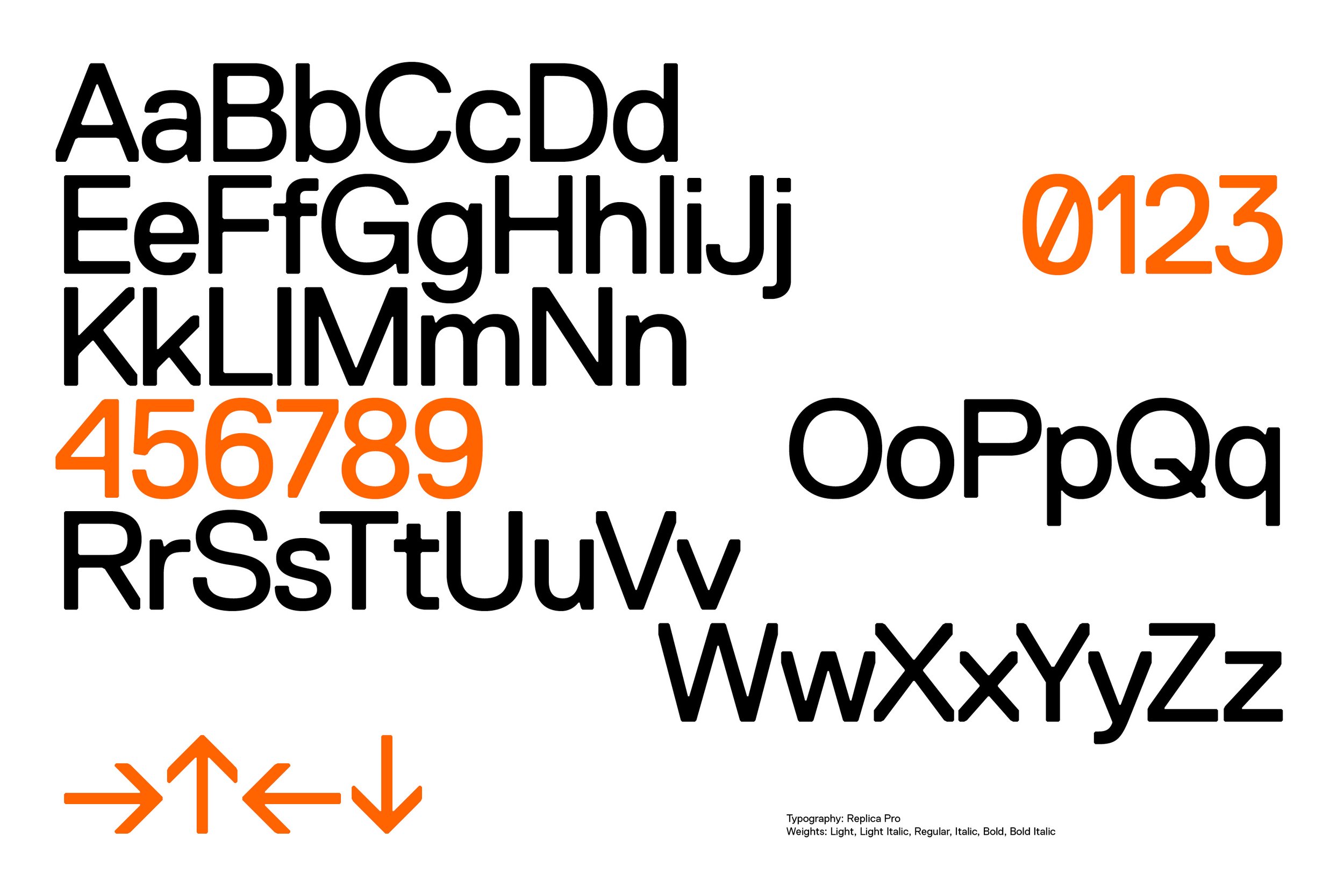
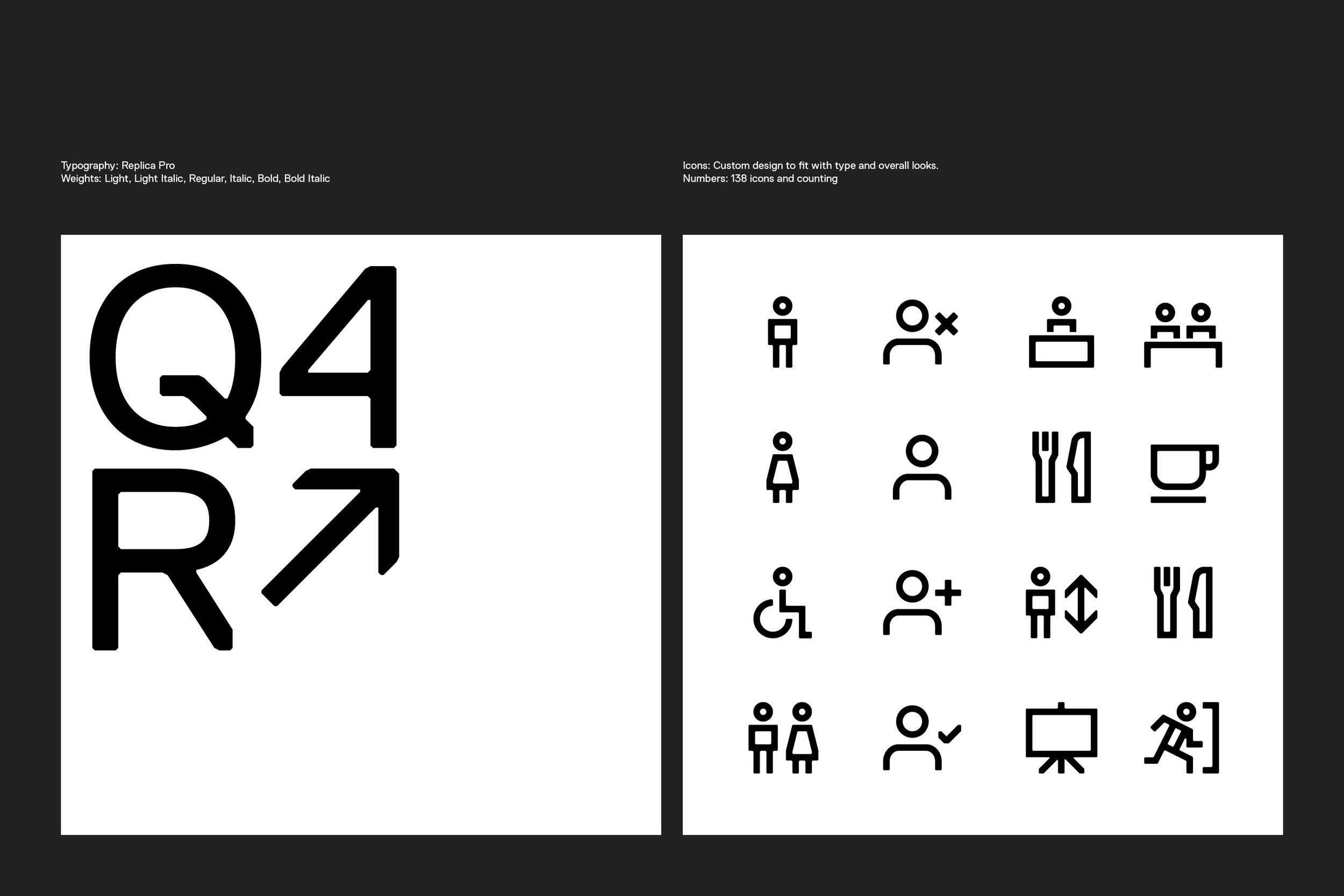
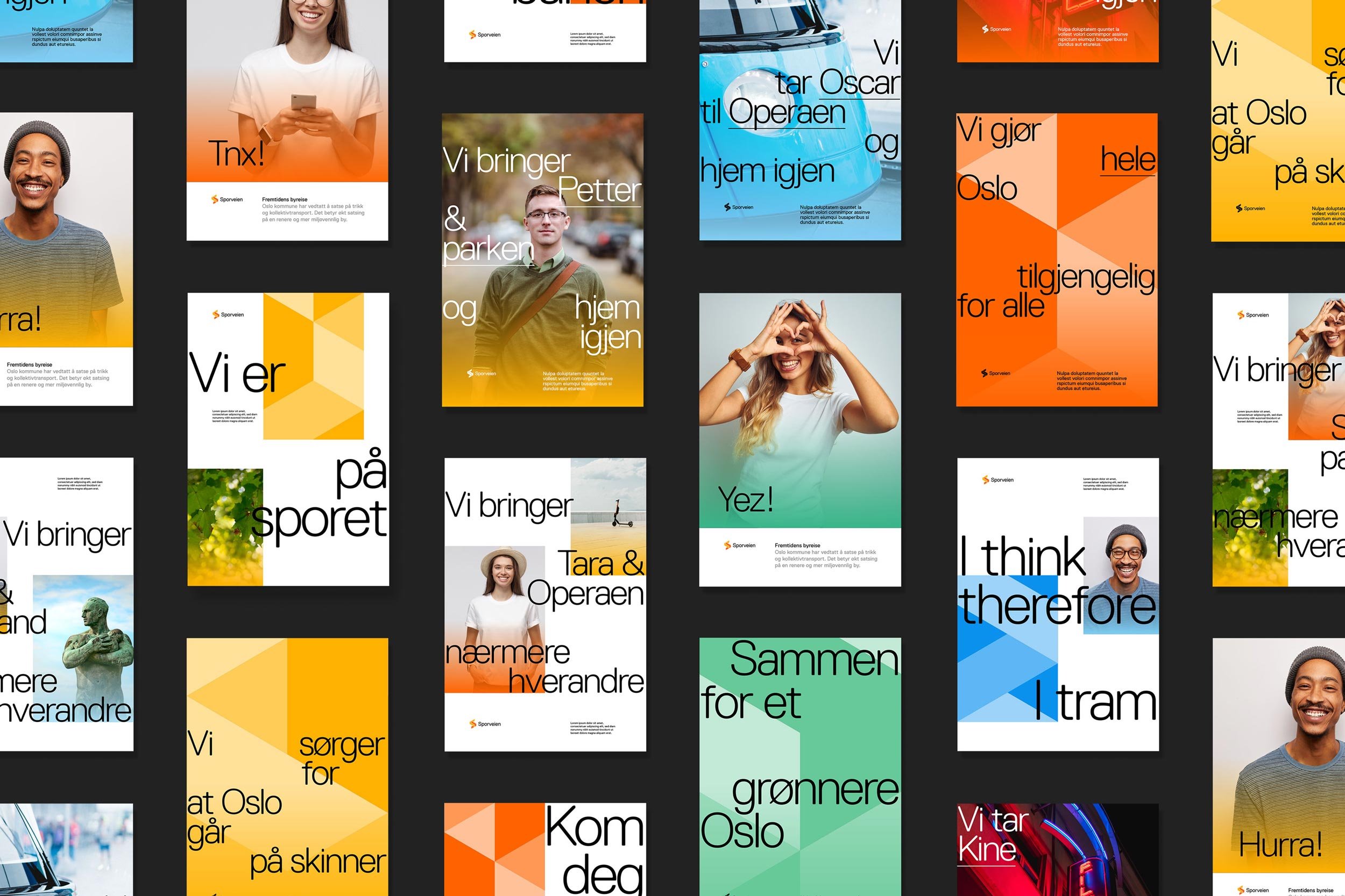
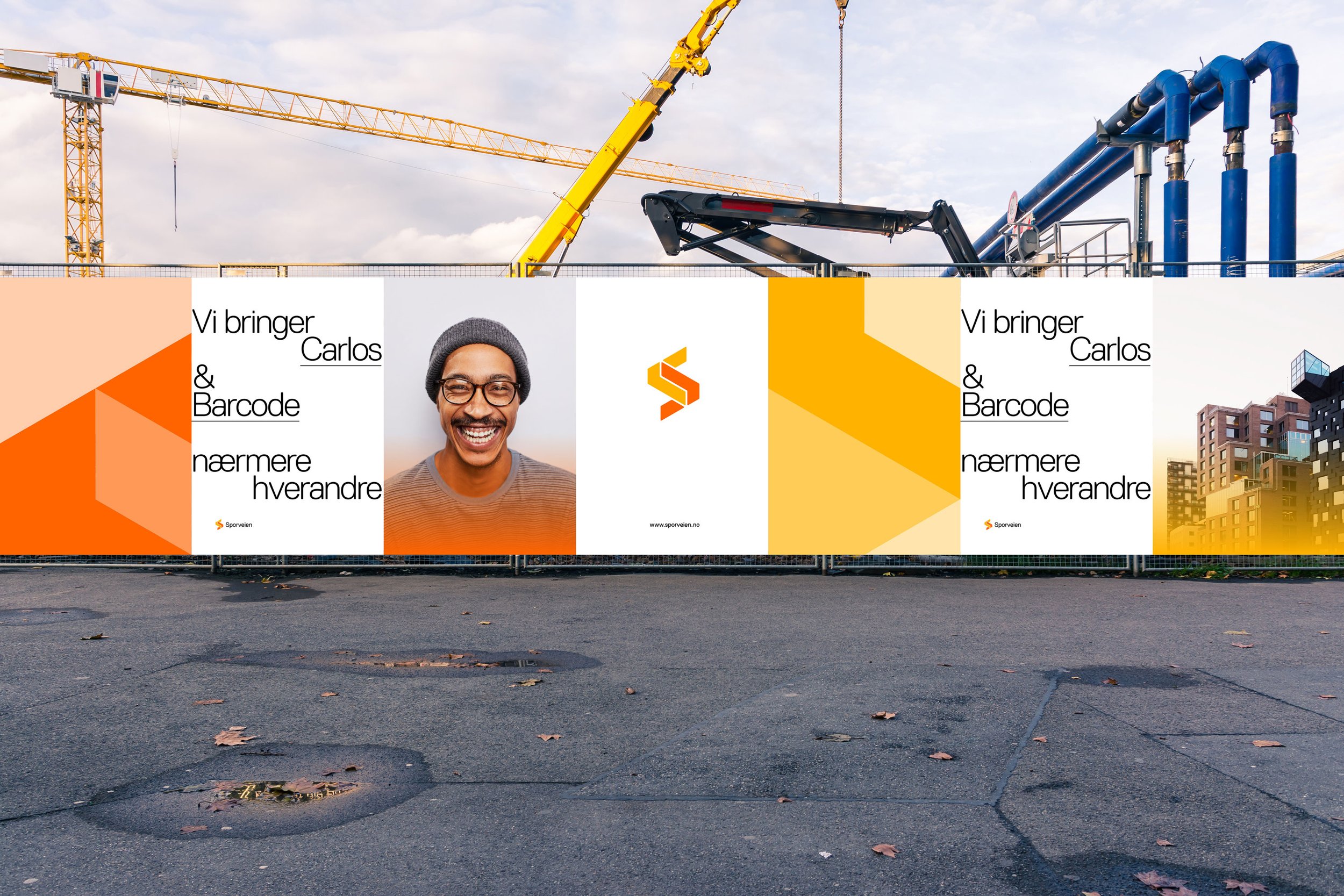
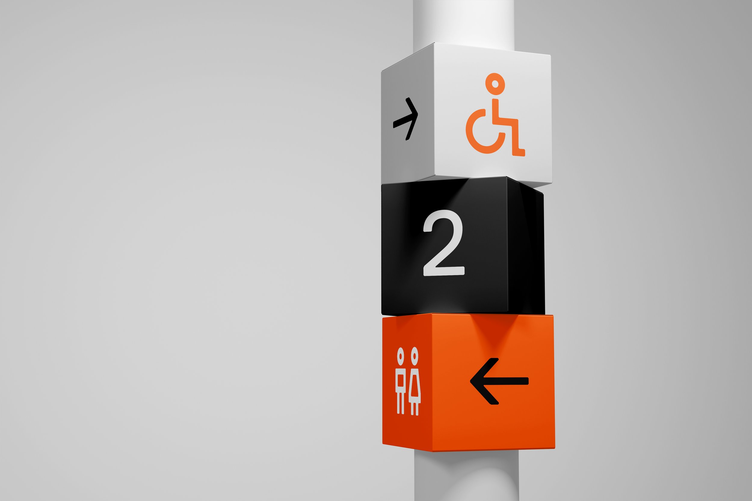
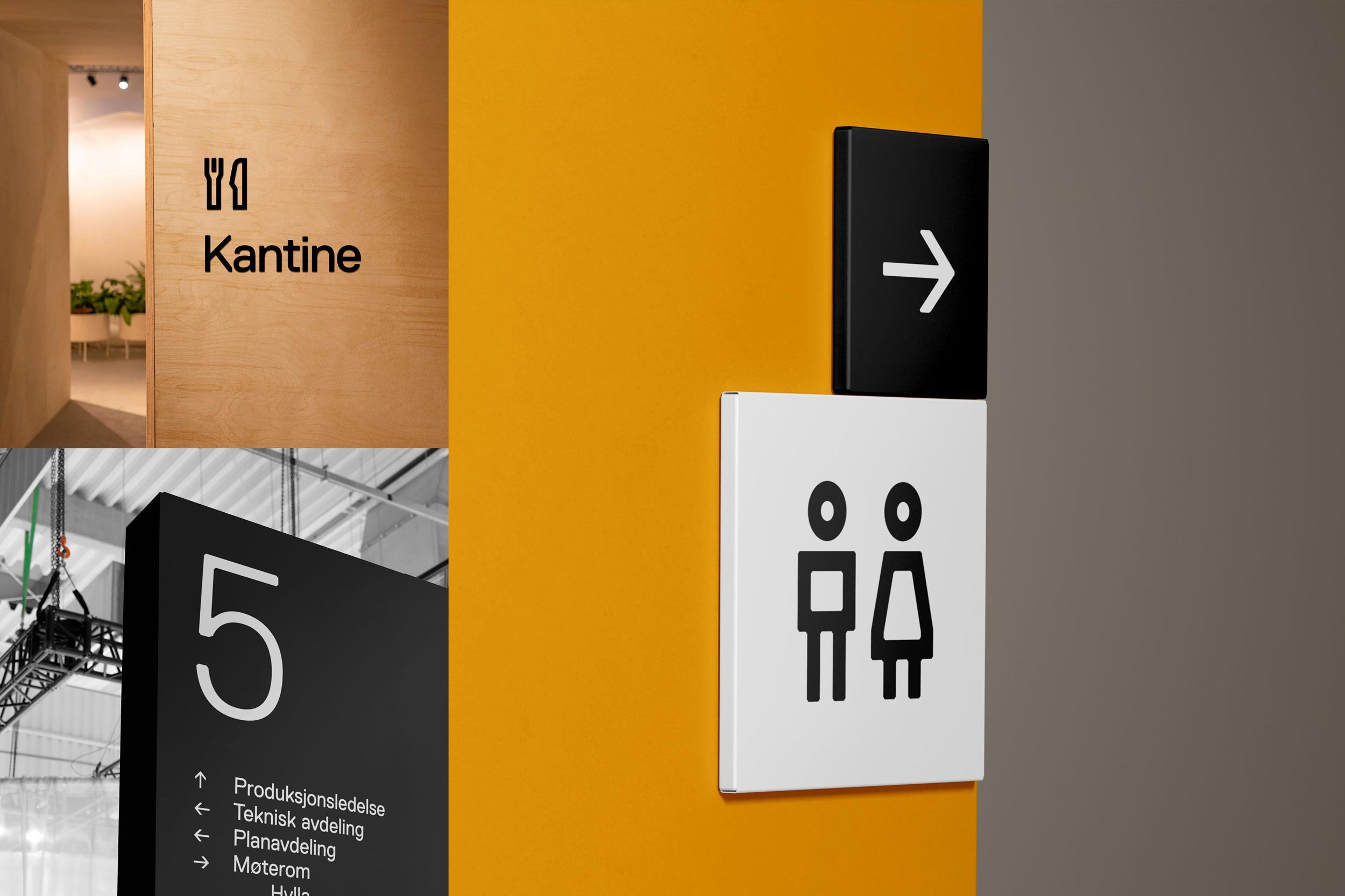
The brand graphics play with the logo shapes in different colours and configurations. This is also the foundation for the layout, grid, and typography. Combined with images, the elements can be used in countless combinations with varying playfulness and dynamics, depending on the need. With a timeless font used in a playful and unexpected way, combined with a friendly tone, Sporveien creates connections with the population in a completely new way.
Result
The new name has already been well implemented, and the profile has made Sporveien considerably more visible in the cityscape. The feedback internally is excellent, and the employees' pride in the workplace has significantly increased. The new brand has helped build a strong identity and culture within the company and has been crucial to their success in reaching strategic objectives in recent years.
Delivered
Customer analysis
Identity system
Signage and wayfinding
Uniforms
Prototypes