Sparebank 1 - Brand identity
Modernization to meet new challenges
In 2006, SpareBank 1 Gruppen decided to renew its brand. Mission was chosen as the design agency, and extensive work to define how this renewal should be expressed was started. The goal was to establish a visual identity that could better contribute to achieving future challenges and goals.
Challenge
An important premise for the work was to ensure evolution, not revolution. Since its launch in 1996, SpareBank 1 has become one of Norway's strongest brands, something that was important to respect. At the same time, the bank saw a number of future challenges that the existing identity would not be able to solve.
Solution
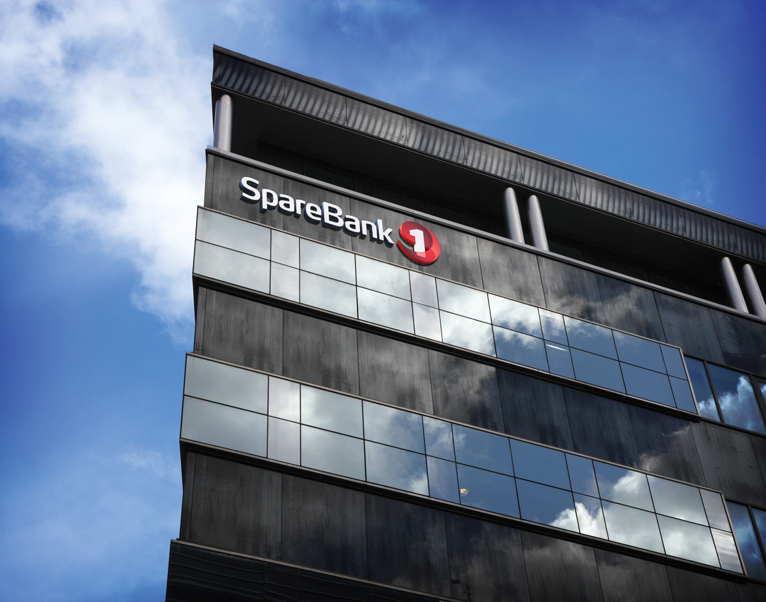
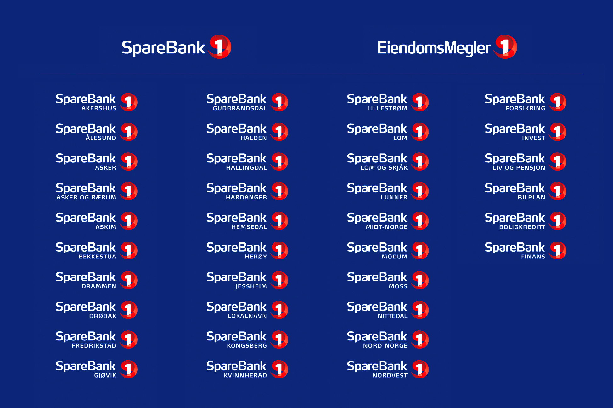
Among other things, developed a new symbol, which should be able to function to a greater extent in new media. A richer color palette was developed, to better communicate diversity and product breadth. All of the sales materials, company materials, signs, etc., have also been changed. The sum of all the elements will contribute to SpareBank 1 being perceived as having the strong customer focus for which the bank is known.
Result
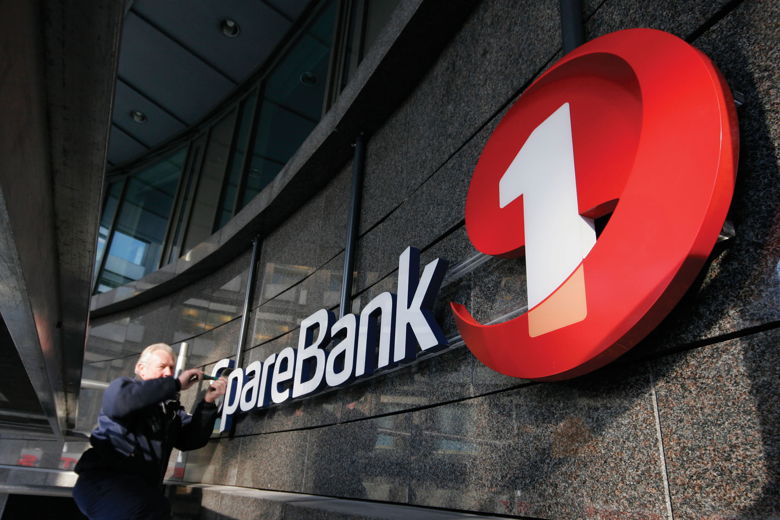
On Friday 4 and Saturday 5 April 2008, all the banks in the SpareBank 1 alliance held events where the new visual identity was presented and reviewed. Several thousand employees participated in these events, be it in Tromsø, Moss, Hamar, Oslo, etc. The same weekend, signs on all of the bank's more than 300 branches were replaced.
“Mission convinced us early on. Their professionalism showed us that they have the broad experience we were looking for. In such processes, we have seen the importance of having a partner who is both able to work strategically, and at the same time be practical. We are now better equipped to tackle the challenges facing the industry. "
- Anette Etholm
Executive Vice President, Market and Brand (2009), Sparebank 1 Gruppen
Delivered
Brand platform
Tone of voice
Graphic profile
Photo bank
Signage
Brochures
Promotions
Presentations
Sales Literature
Supplies


