Aktiv_Hero2.jpg

Active Real Estate - Brand Identity

How Can We Demonstrate Unity Between Our Businesses?


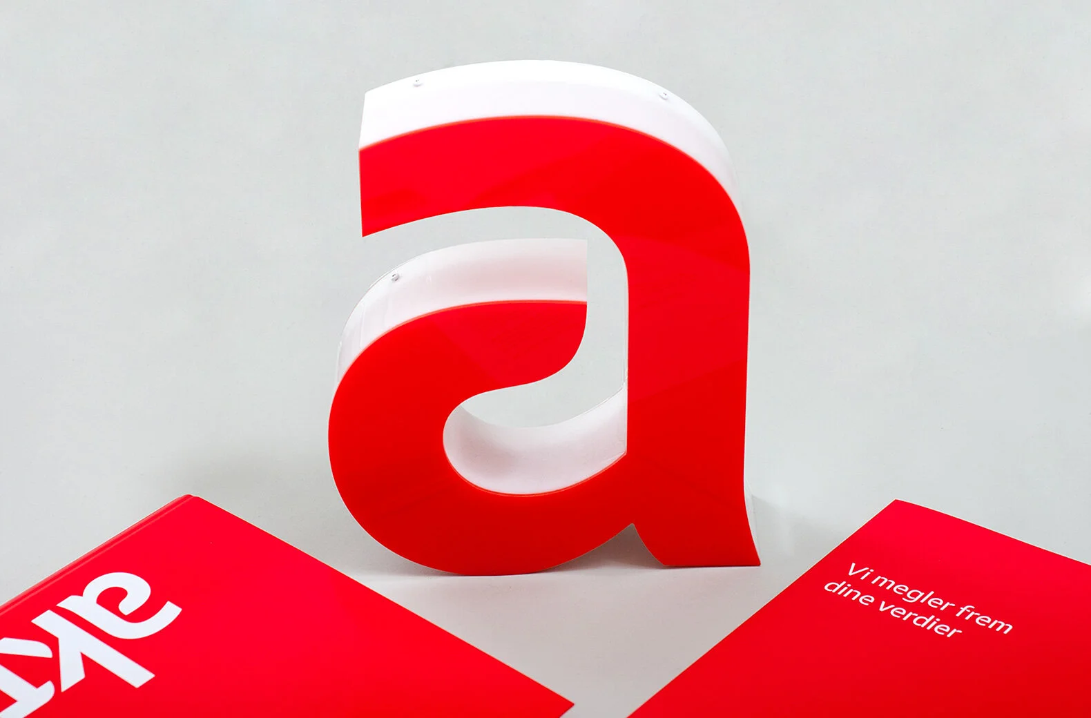
Eika had a close partnership with Aktiv and Terra Real Estates. As part of the Eika rebrand, Mission was assigned to reinterpret the new Aktiv identity, while still allowing the Aktiv brand to distinguish itself in the highly competitive property market. So we took ownership of the colour red, as it was not used by any other competitors.

Eika and Aktiv now stand side by side as two partners. This makes the cooperation between the two clear to the market. At the same time, Aktiv is very recognisable on the property pages, on the web, on the street and during viewings.

Solution

Much of Eika’s identity adapted well to Aktiv’s needs as both brands thrive on being close to their local customers. However, we needed to find a way to clearly differentiate the two services beyond their names. After researching identities in this sector, we discovered that the colour red wasn’t claimed by any of their competitors. Given that red is the most visible colour, we grabbed it instantly!

Result

Eika and Aktiv now stand side by side as clear partners making their connection obvious to the market. At the same time, Aktiv is unmistakable on the property pages, online, in the high street and at viewings. As a result, the brand now compliments the dynamic company that has enjoyed the most satisfied customers for four years in a row.


Delivered

Brand Identity

Image Bank

Signage Program

Sales Literature

Website

Aktiv_Eika_logos.jpg
The design of Aktiv can be used on signboards to create feelings for the end user.
 
Collaboration across brands contributes to the improvement of and more forward-looking design.
The design agency in Oslo visualizes the design through the display buck of active.
Active stands for many properties. It appears especially in children which designs actively choose to have.
A clean design by specialists from a design agency in Oslo - Mission can bring out the most important elements.
Inspection and visually attractive design emphasize professionalism.
The collaboration between active and the design agency in Oslo - Mission.
 
Active's identity is reflected through the design of the business cards. Design agency that focuses on the right identity.
 
Logo development and design has a common thread from website to brochure and more.
Logo design, website and several minor visual attributes reflect the identity.
In different formats, it is important to have the right design and size. Here, the design agency has been aware of the size of the Ipad.
 
Collaboration with Aktiv should be a bit playful as design is in focus and should emphasize the values of children and adults.
Design can be represented in different ways. The design agency in Oslo shows where on the planet Oslo's affiliation is.
The original that was designed to create a completely new brand identity in Oslo and Norway.

Let's make magic together!

Previous
Previous

BAMA Storkjøkken – Brand Identity

Next
Next

Talent Norge – Brand Identity