Eika Alliance – Brand Identity
Renewing a Classic Symbol
Services
The Eika Alliance exists to strengthen local banks with products and services to compete with the larger national banks without losing focus on their local expertise. Therefore, an updated identity system was developed, with a new oak symbol at the centre. Combined with products and services from Eika, the local banks emerge as full-fledged brands with professionalism and expertise.

The oak tree has traditionally been used as a symbol for local banks throughout Norway. It indicates strength and stability. In addition, roots, branches and acorns can represent history, unity and future.

Two versions have dominated, with a number of alterations: One is an organically detailed tree, which can be perceived as old-fashioned and challenging to use on small digital surfaces. The second is a stylised symbol from the 70's, with sharp angles, that can resemble a lot of things, other than an oak tree.

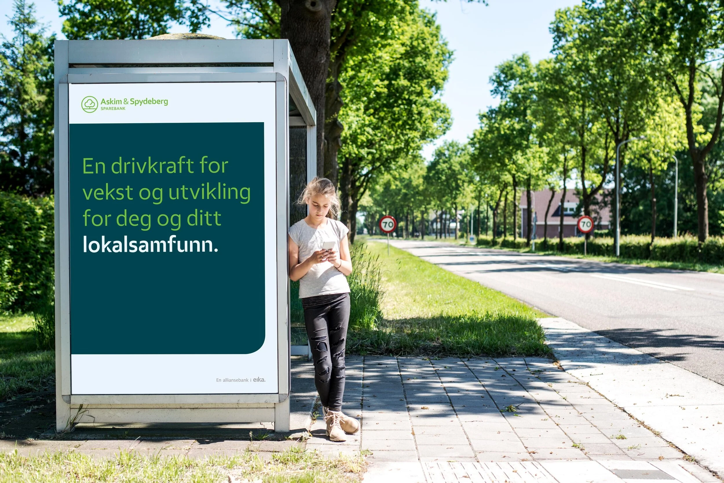
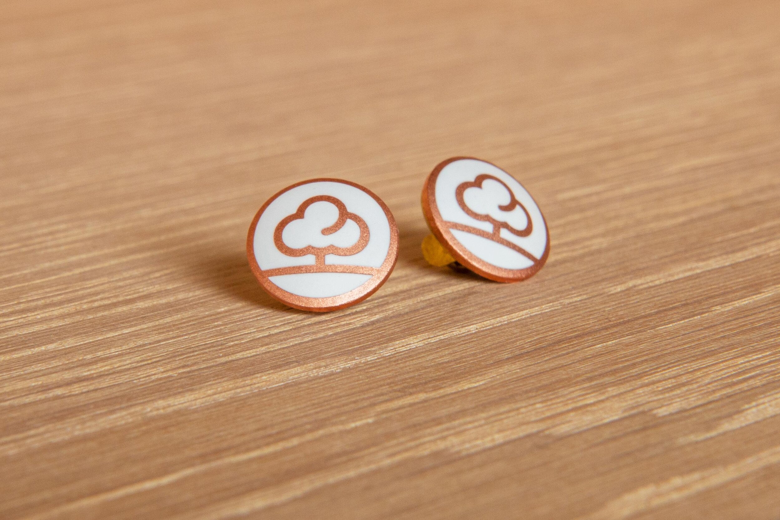
A simpler stylised symbol was designed based on round shapes. Placed in a circle, it comes across as a simple and unique symbol, with a friendly and modern expression.

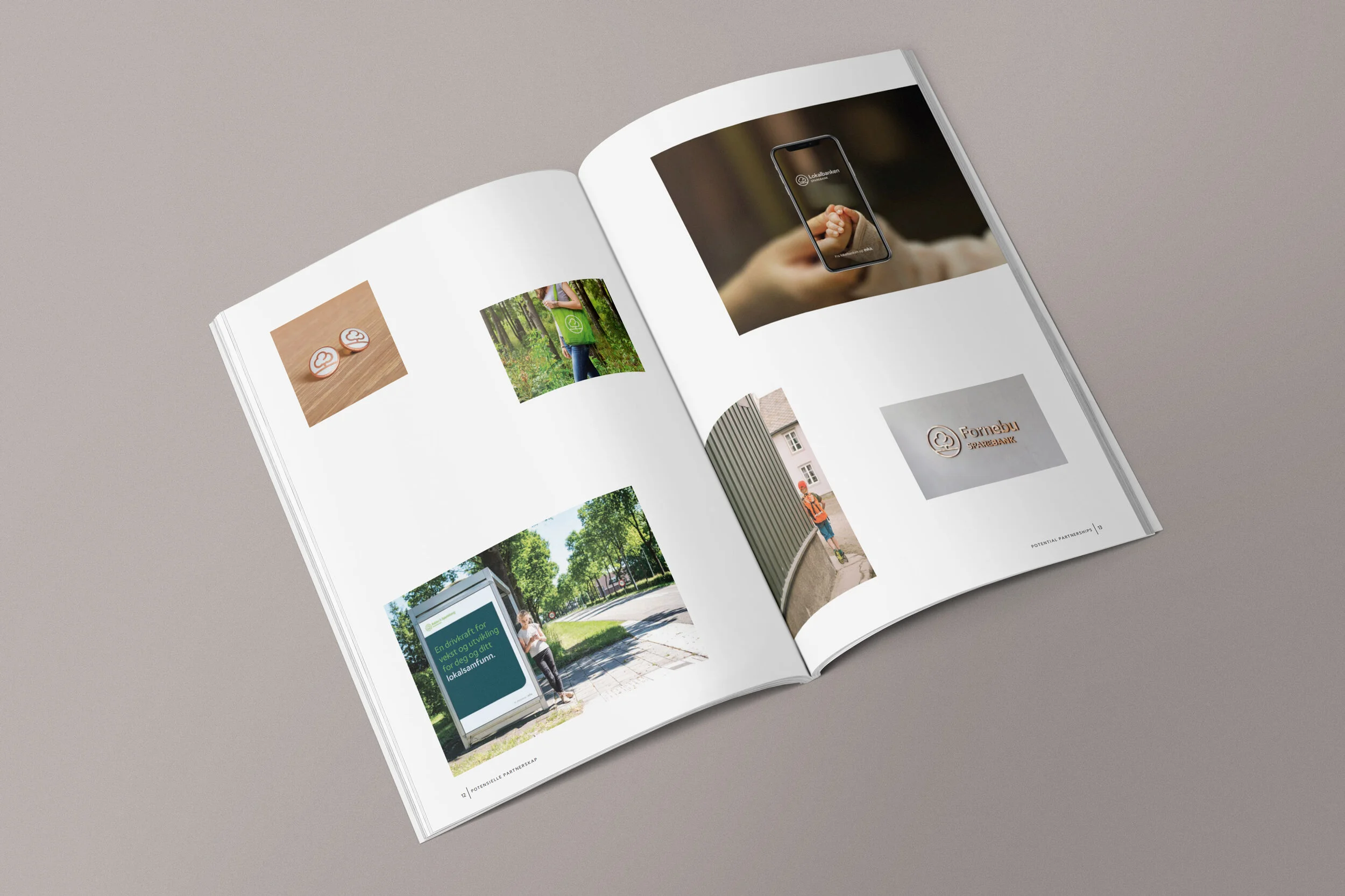
A fixed layout with symbols and names was established to give local banks the opportunity to adopt a common expression, which harmonises with the alliance's identity.
In addition, separate symbols for selected products and services have been designed based on the symbol and the symbolism of the oak tree.


Challenge
The oak symbol used by Norwegian saving banks is one of the oldest and most beloved symbols in the country. Many local banks still use this symbol, or variations of it, today. The Eika Alliance gave Mission the task of modernising the oak symbol for local banks wanting to use it. One of the reasons for the update was that the classic oak did not work satisfactorily on digital platforms. There was a need for the new symbol to be used for everything from the smallest favicon (web icon) to the greatest wall backdrop. For this challenge, simplicity was key.
Solution
It proved important that the chosen symbol not only be simple and direct but also comply with digital technology and function across other widely used products and services, specially developed for the bank alliance. The shape of the oak symbol is made up of four circles, and it gives the tree a smooth and confident look, fit for a bank that wants to welcome you. At the same time, you notice that the tree itself is both solid and robust, precisely how you would want your local bank to be.
Result
Rørosbanken was the first bank to use the new oak symbol in its logo. The bank launched its new look during the Norwegian Ski Championship in 2015, taking place in Røros. Since then, quite a few other banks have chosen to use this symbol alongside their logo, and by doing so, they send a clear signal that they are local banks in their communities, but at the same time modern and flexible.


"I am pleased to see how a simple 'kit of parts,' can transform the impression of each bank, wherever it is located in Norway."
Ole Rølvaag, Group CSO, Eika Gruppen
(2021)