Herkules Capital – Brand Identity

How Can We Build on Past Success and Prepare for the Future?

Herkules Capital operates in Norway and Singapore. They have invested in and developed companies with growth potential – for a total of NOK 15 billion. Herkules is quite unique among investors, and can explain much of its success by the close collaboration with the owners and management teams, which strengthens the businesses in the long run. “Building tomorrow's winners” addresses the founder's purpose for the company and inspires new members of the team to take the company forward.

The new identity has a symbol and imagery that focuses on building forward and upward. Furthermore, the upgrade of the identity will support Herkules' ambitions, giving the company a renewed focus and making them stand out in a highly selective world.

Mission designed different types of images, videos and more for a consistent tone of voice.


Delivered

Communication platform

Brand Identity

Tone of Voice

Image bank

Website

The message of Hercules was communicated through various types of design and Mission developed a communication platform.
Photo taken to visualize safe settings and quality.
Herkules won the Gullsnitt award for the visual details in images of the frame, which is designed to show sharpness, security and quality.
Herkules Capital represents a new brand identity and the strengths we have as a company through a secure framework.

Photo: Damian Heinisch
Portraits: Steffen Aaland

Photographer Damian Heinisch was awarded in Gullsnitt 2015 for the brand images.

Mission designed a brand guide so that Herkules ensured that all tools had a stable tone of voice, clear typography, a clear signature and colors that represented the brand.
Herkules' colors create credibility, excellence and are designed to align with the brand.
 
Herkules are investors who want a graphic profile that visualizes how market share is distributed. Various parameters in the company are visualized with the color palette.
 
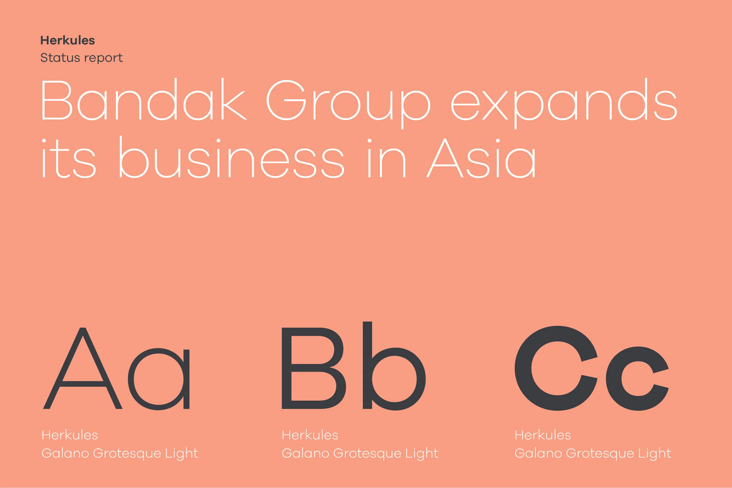
Mission established a template for how Herkules can produce status reports.
Patrik Egeland in black and white. The importance of a concrete brand identity reflects Herkules.
Ann Christin Gjevik is pleased with the new Herkules brand.
 
Mission designed business cards for the employees at Herkules. At the same time, other props that can be used in a business context were produced.
Herkules has a wide range of materials for everyday use with customers. Mission designed a tone of voice that is consistent.

Let's make magic together!

Previous
Previous

Eika – Purpose

Next
Next

Køltzow – Brand Identity