The Student Teachers – Brand Identity
A Purpose that Motivates
Services
All companies have a purpose, even if it is not always stated. Purpose is what motivates you and gives you focus. When we started working with the Teacher Students, the desire for focus and clarity in relation to their role towards the students was among the most important reasons why they wanted a new identity.
Challenge
The Student Teachers Association of the Norwegian Education Association is Norway's largest trade union for student teachers and pedagogues with over 20,000 members. They work to ensure that all members receive the best possible education, so they are ready to enter the world's most important profession.
Before we started the identity work, it was important for us to uncover the purpose of the Teacher Students. A clearly defined purpose has the distinctive quality that gives organizations and companies something to rally around. It should contribute to focus and help those who take on positions to perform even better. A meaningful purpose will create a more emotional connection with the members, and make it easier to develop unique experiences for them.
Solution
The purpose we developed was about everything that membership in the Teaching Students can contribute to – community, unity and belonging. It also expresses the motivation for the study, and reminds everyone involved that teaching is the most important job in the world. A logical consequence of this is that the Teaching Students must be the most important students in the world!
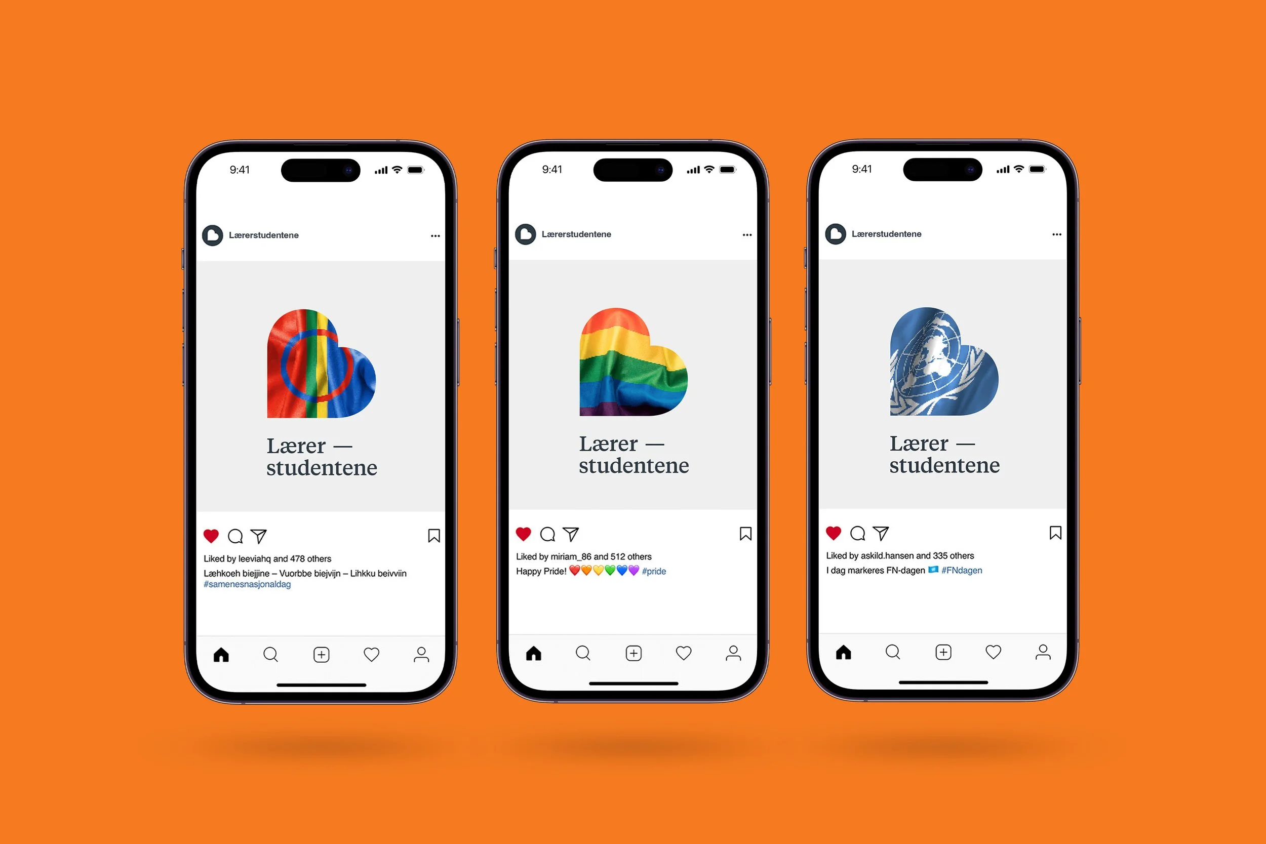
Once the purpose was in place, it was easier to tackle the identity job. Choosing a profession within pedagogy and education also includes a good dose of care – for education, students and the future. The heart is a universal symbol for precisely this. Turned on its side, it also becomes a large L. The expression is bright and light with a warm color palette.
Result
The student teachers have been given a purpose that emphasizes how important they are in society, for the students and for the teaching profession. They have also been given an identity that emphasizes this, and that will stand the test of time well. Different messages and texts will help keep the identity alive and relevant, which is very important for a membership organization that is dependent on recruiting new members all the time.
Pedagogstudentene's new identity makes it clear for all students, now and in the future, that they have a lot to be proud of, be it as students, or later as teachers. In the long term, this serves as a continuous reminder of how important teachers and students of the profession are. Moreover, it may help ensure that this professional group receives the priority, consideration and rewards they deserve.
"The solution helps to substantiate the story of who we are and what we are fighting for, and it helps create a common direction in the work of politics and our organisation."
Frank Aleksander Bræin – leader of the Student Teachers
(2019)
"Mission has made an identity that perfectly fits the organisation we are. Serious, but not pretentious. Academic, but playful. Focused, but versatile. The biggest, but passionate about individuals."
Jonas Ohlgren Østvik - Adviser, organisation and recruiting
Photo: Chris-Håvard Berge/Oclin


