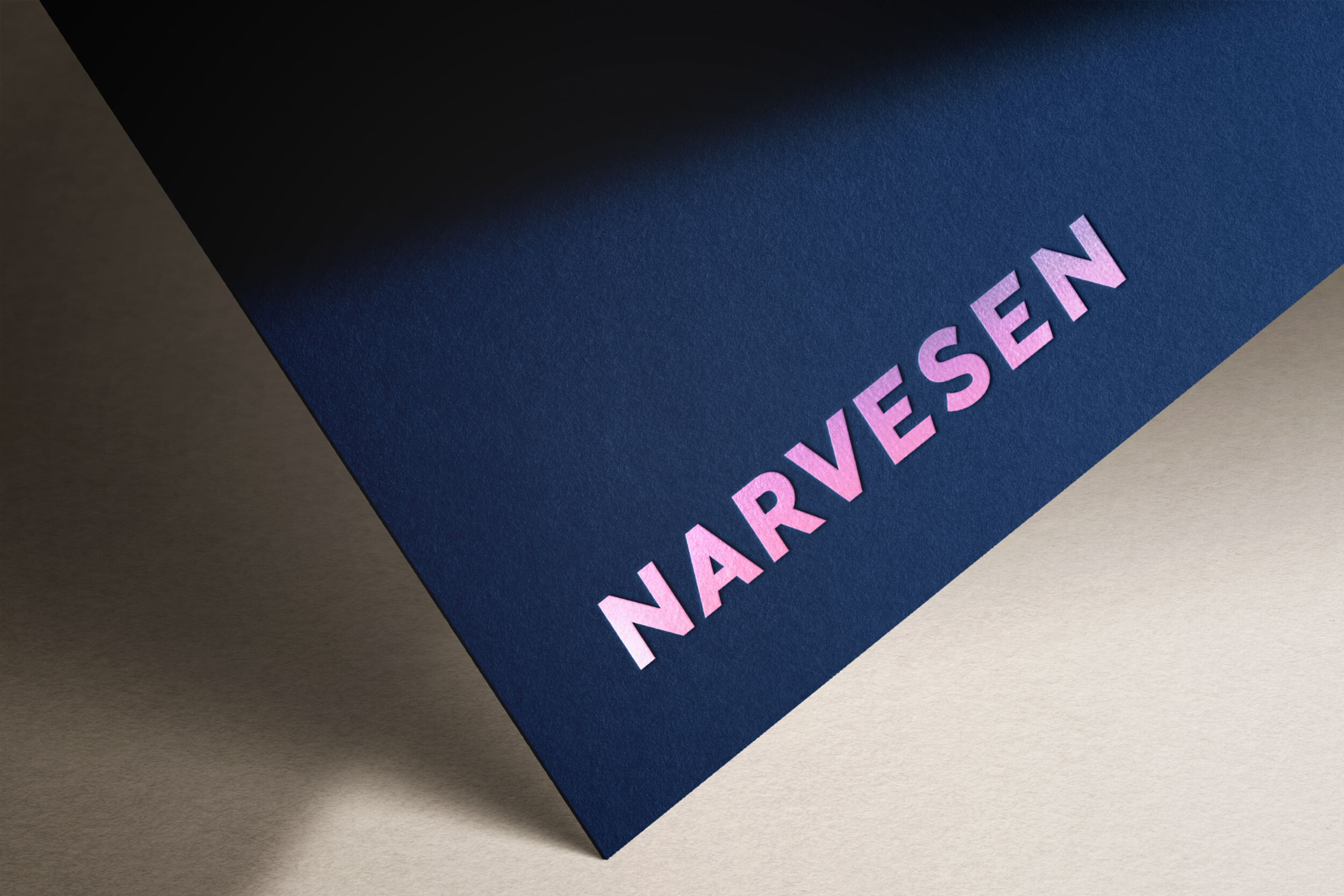
Narvesen – Brand Identity
Renewal of a Brand in the Face of a Radical Shift in Retail
Services
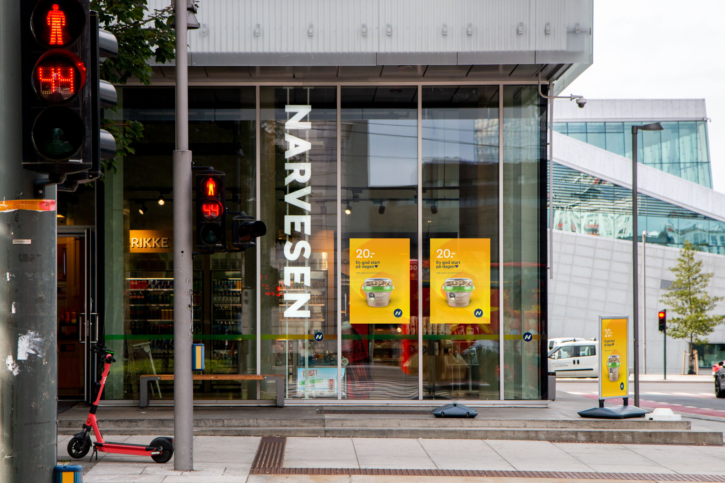
Narvesen is a convenience store chain, with 350 outlets across Norway. The stores serve 200,000 customers daily, providing quick purchases from coffee to confectionary, magazines to movie tickets.

"Our partnership with Mission has given us a new focus. The result is a more positive customer experience, clear leadership and strong growth."
Stian Breivik
Category and Marketing Director, Reitan Convenience
(2021)
Challenge
It had been well over a decade since Narvesen had invested in its brand. While still holding a solid position, things were changing radically in the sector – redefined by specialists, discounters and online providers. Mission were commissioned to review their situation and make recommendations to take the brand forward.
We determined that Narvesen’s purpose, “A bright point in everybody’s day,” was a valuable proposition, but the idea had been neglected over time. We strived to reaffirm this philosophy. Convenience has become an essential luxury in a world starved for time. That is Narvesen’s strength, and we had to revitalise that connection in their customers’ daily lives.
Solution
So how do you nurture customer relations in less time than it takes to buy a pack of gum? We developed a concept called “Flow,” a principle at the heart of every customer’s needs. Flow is a breath of fresh air from vast product choices to inspiring selections, fluid movement, to fast transactions. It’s difficult to touch, but felt everywhere – visually, physically and through easy service.
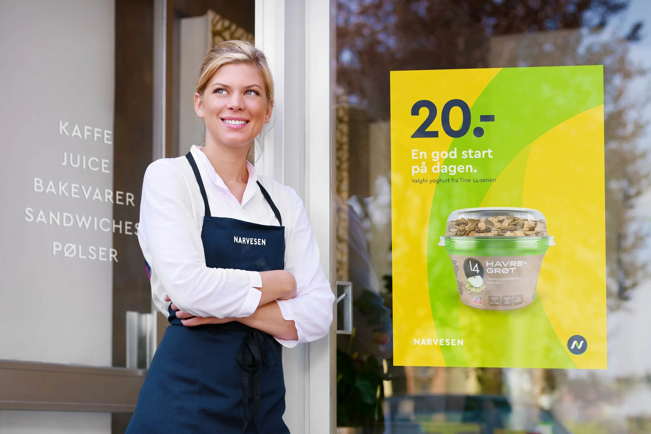
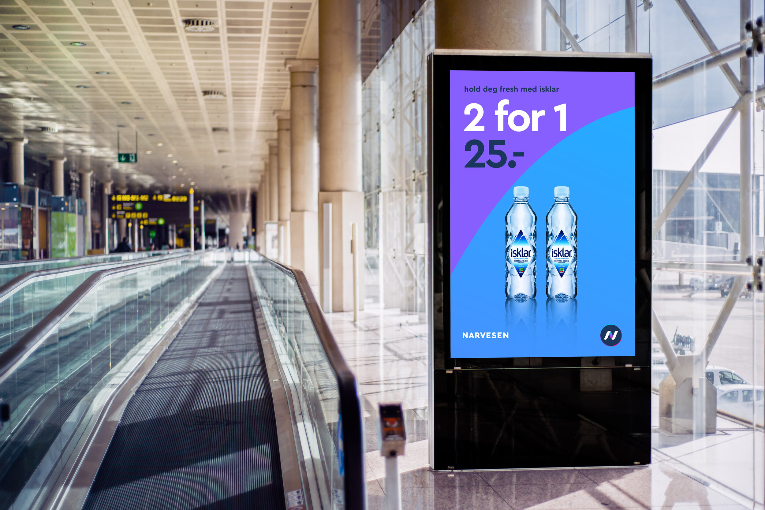
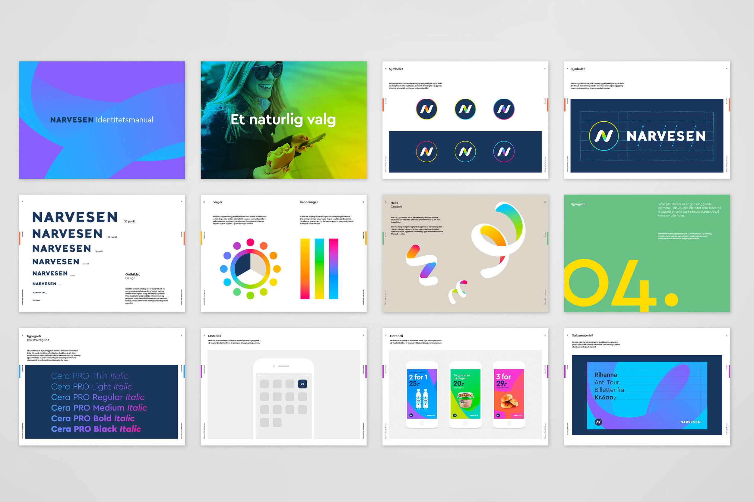
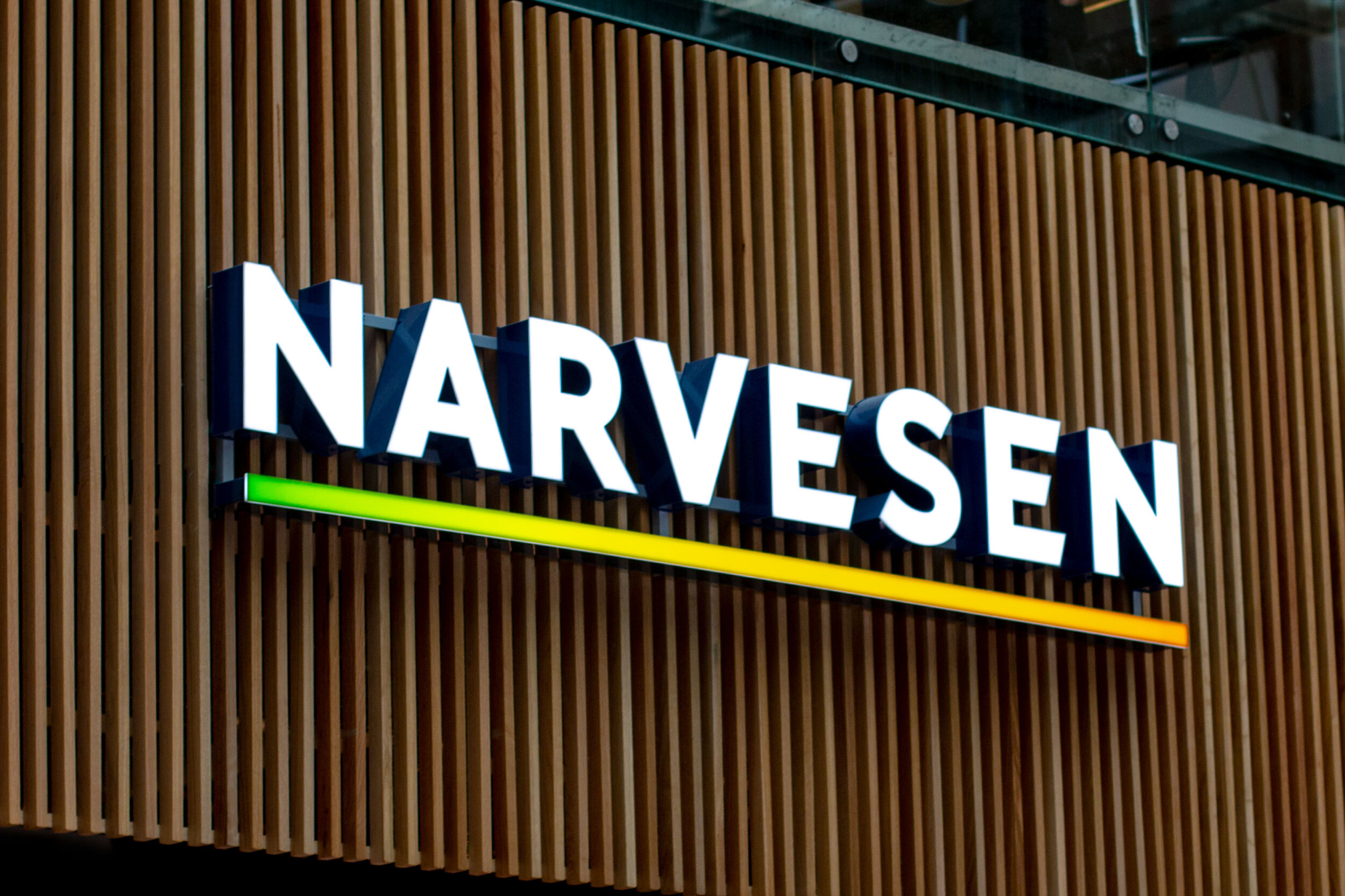
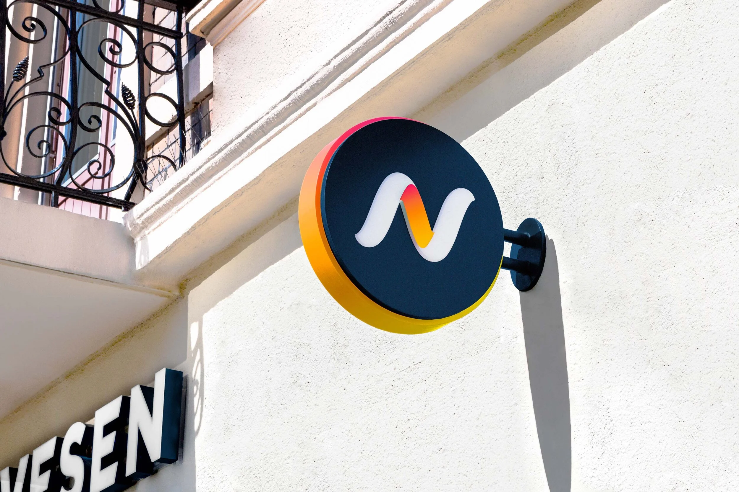
As part of our renewal program, we needed to address the brand identity, which is an icon on the streets of Norway. To continue the legacy that Narvesen had built, we maintained the immediately recognisable ‘N’ initial, but reworked it under the principle of flow. An integral function of this identity would be signage. We took great care to balance the new expression, with the demands of visibility, across an unpredictable number of environments.
Result
The Norwegian Customer Satisfaction Barometer by Norwegian Business School BI measures customer satisfaction and loyalty, with more than 9,200 consumers taking part in the survey. They declared Narvesen as a clear first place in the kiosk category. The new brand identity is currently being rolled out in 350 locations in Norway.

Delivered
Customer analysis
Identity system
Signage and wayfinding
Uniforms
Prototypes
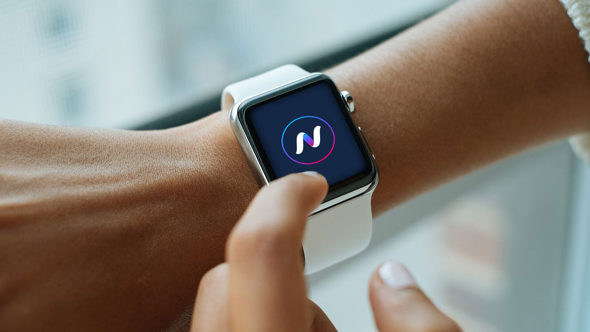
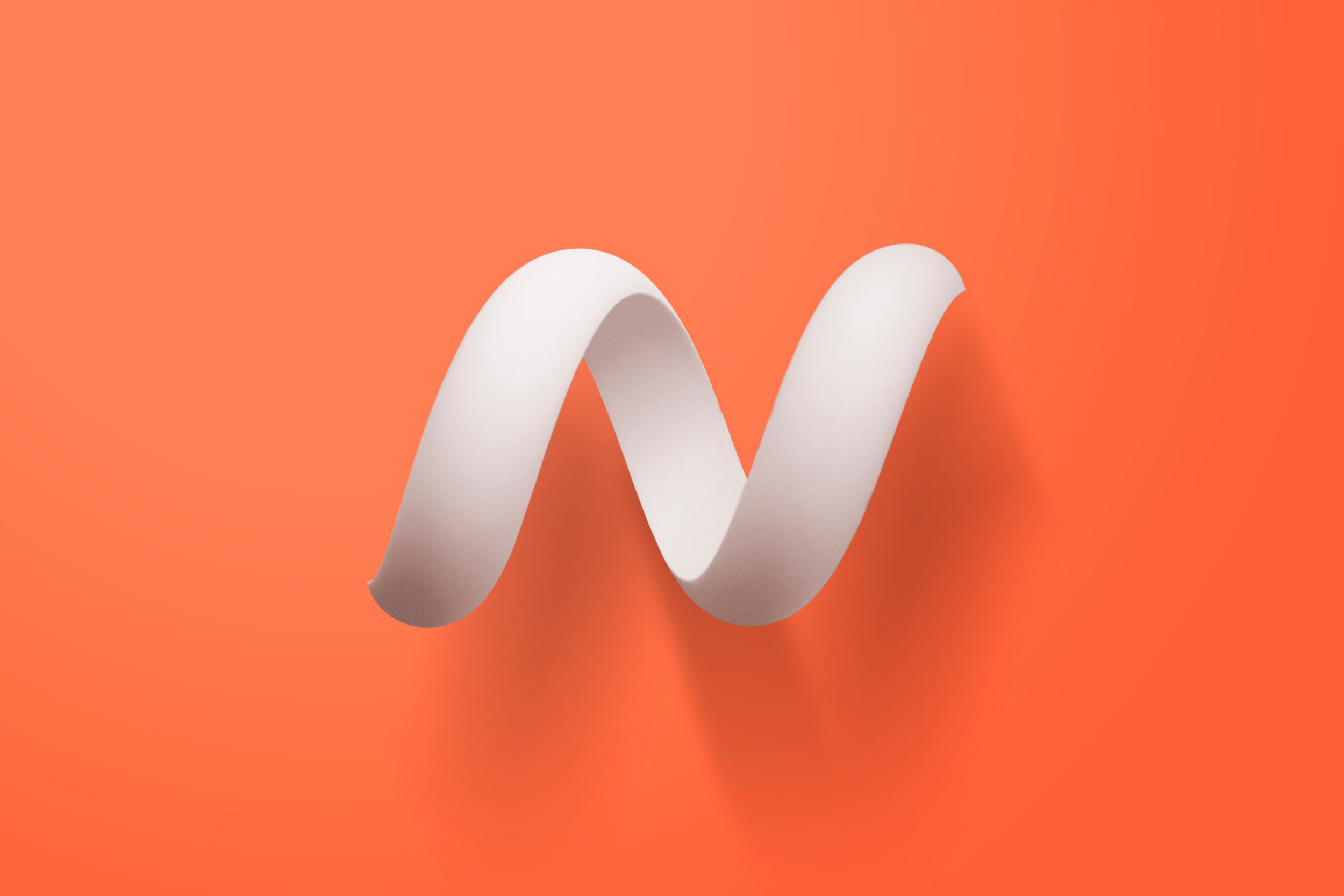
Helix
The new symbol is both a wave when viewed flat on paper and a 3-dimensional helix when viewed from other angles. With its undulating shapes and mathematical precision, it is both an N for Narvesen, and a good symbol for flow, dynamics and movement. This provides us with a lot of exciting opportunities for digital communication, whether it is on screens in store or in the app on your phone.
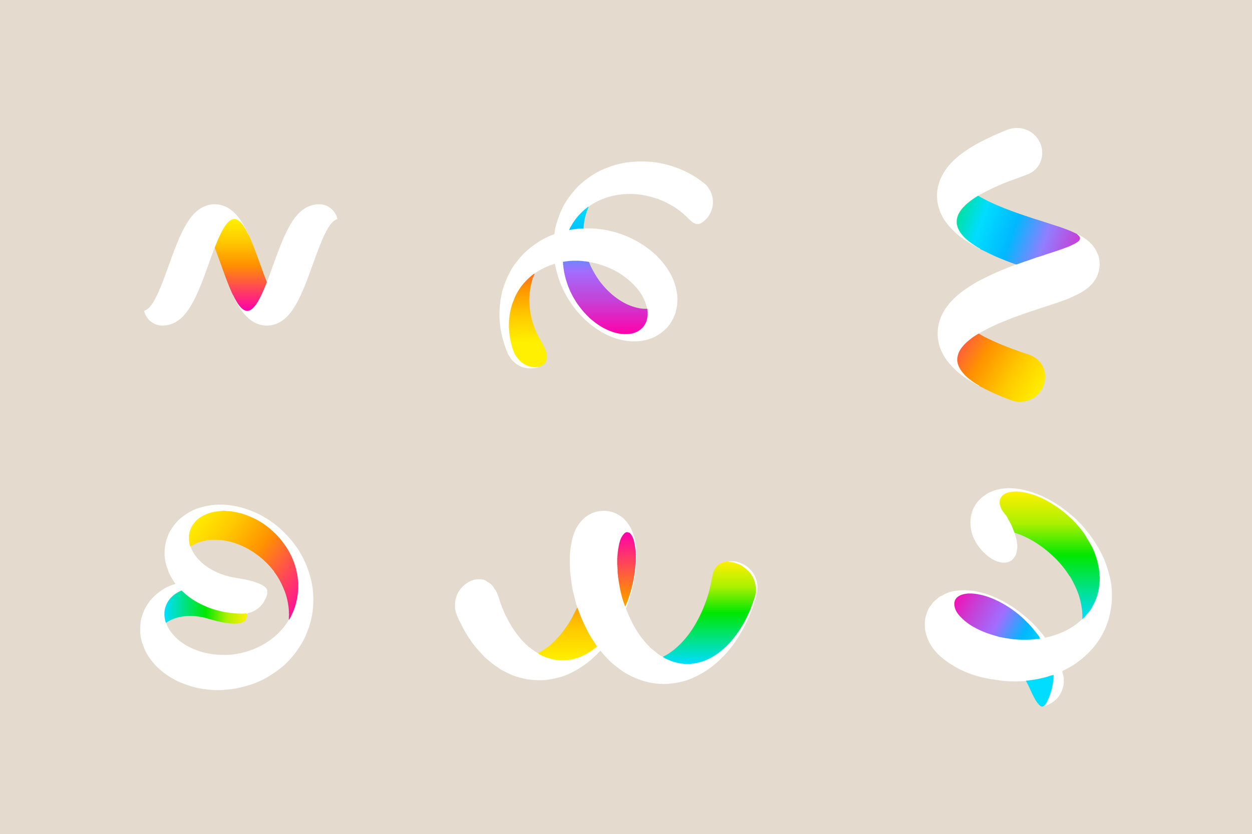
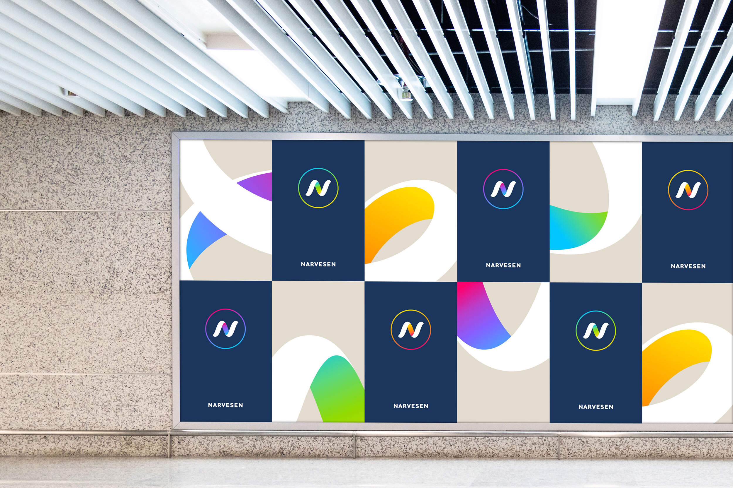
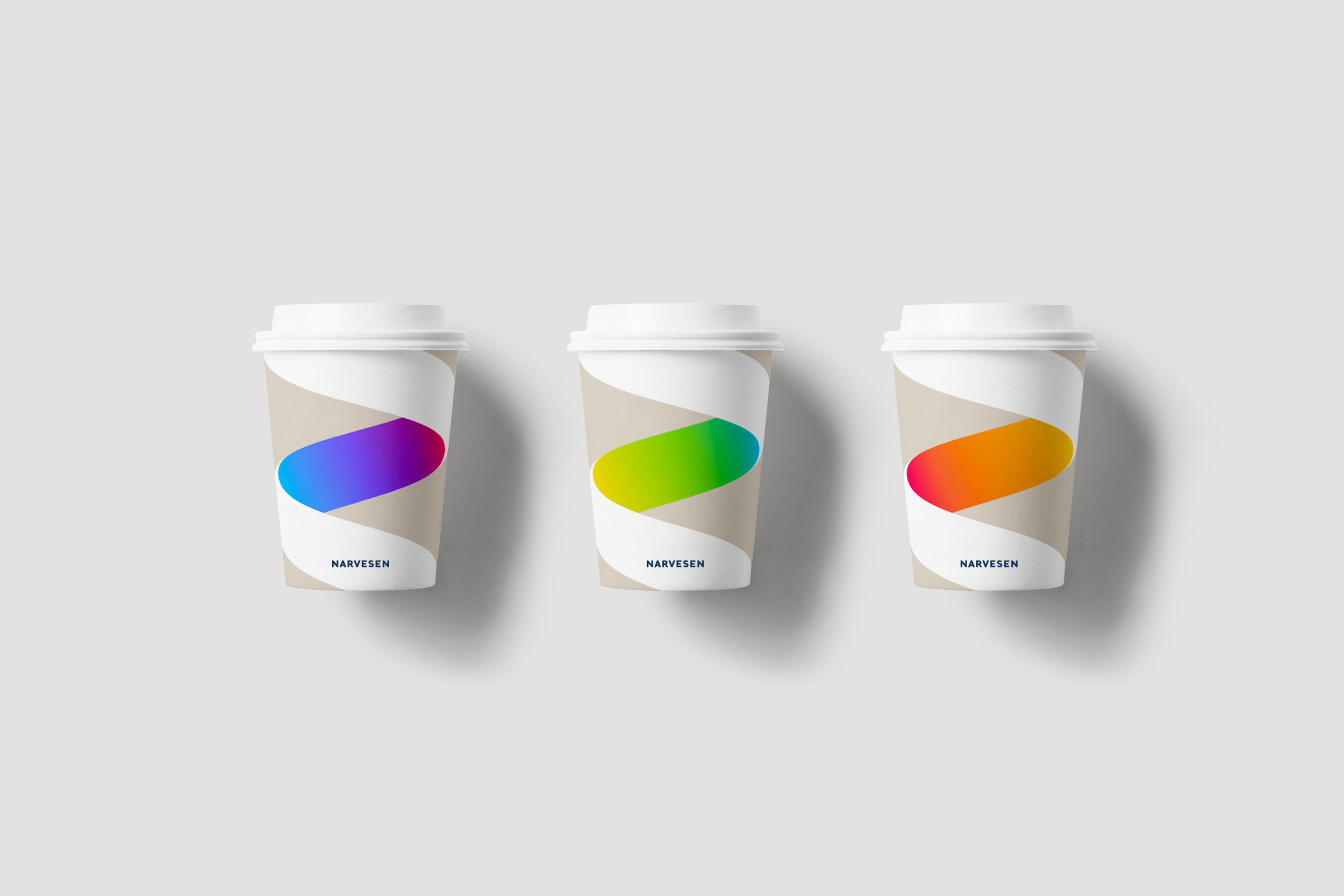
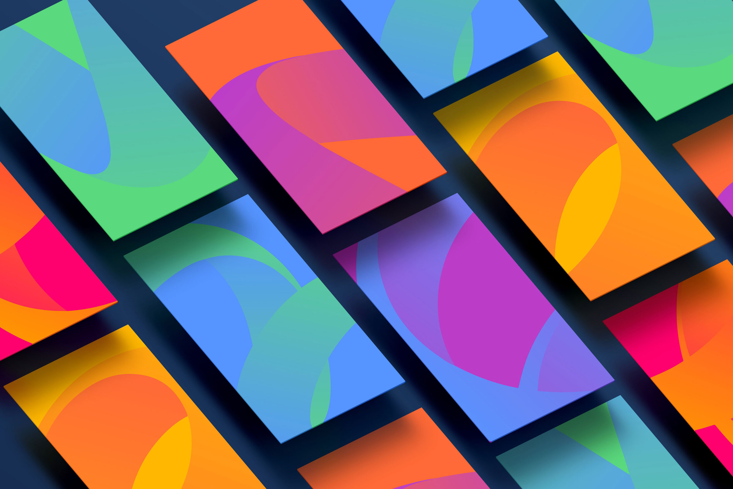
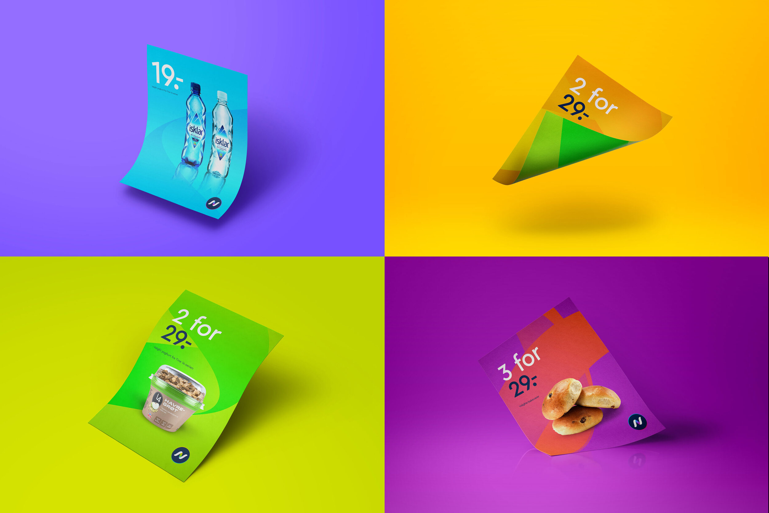
The whole spectrum
A more modern colour palette was introduced, with tones that change across the spectrum, reflecting Narvesen's variety and availability night and day. Typography, layout and photo style were coordinated to provide a versatile identity capable of marketing freshly brewed coffee one day and the latest issue of an interior design magazine the next day. The new identity contributes to an experience that affects every single point of contact with the customer, from smartphones to a physical shop - the feeling of being in flow should be felt everywhere, every time.