Narvesen – Retail Branding
The Art of Balancing Speed and Customer Experience
Services
Narvesen is a kiosk chain, with 350 outlets across Norway. The shops serve 175,000 customers every day, providing quick purchases from coffee to confectionary, magazines and cinema tickets. However, the increasing threats from retail specialists, cafés and online competition forced Narvesen to reappraise its brand.
Challenge
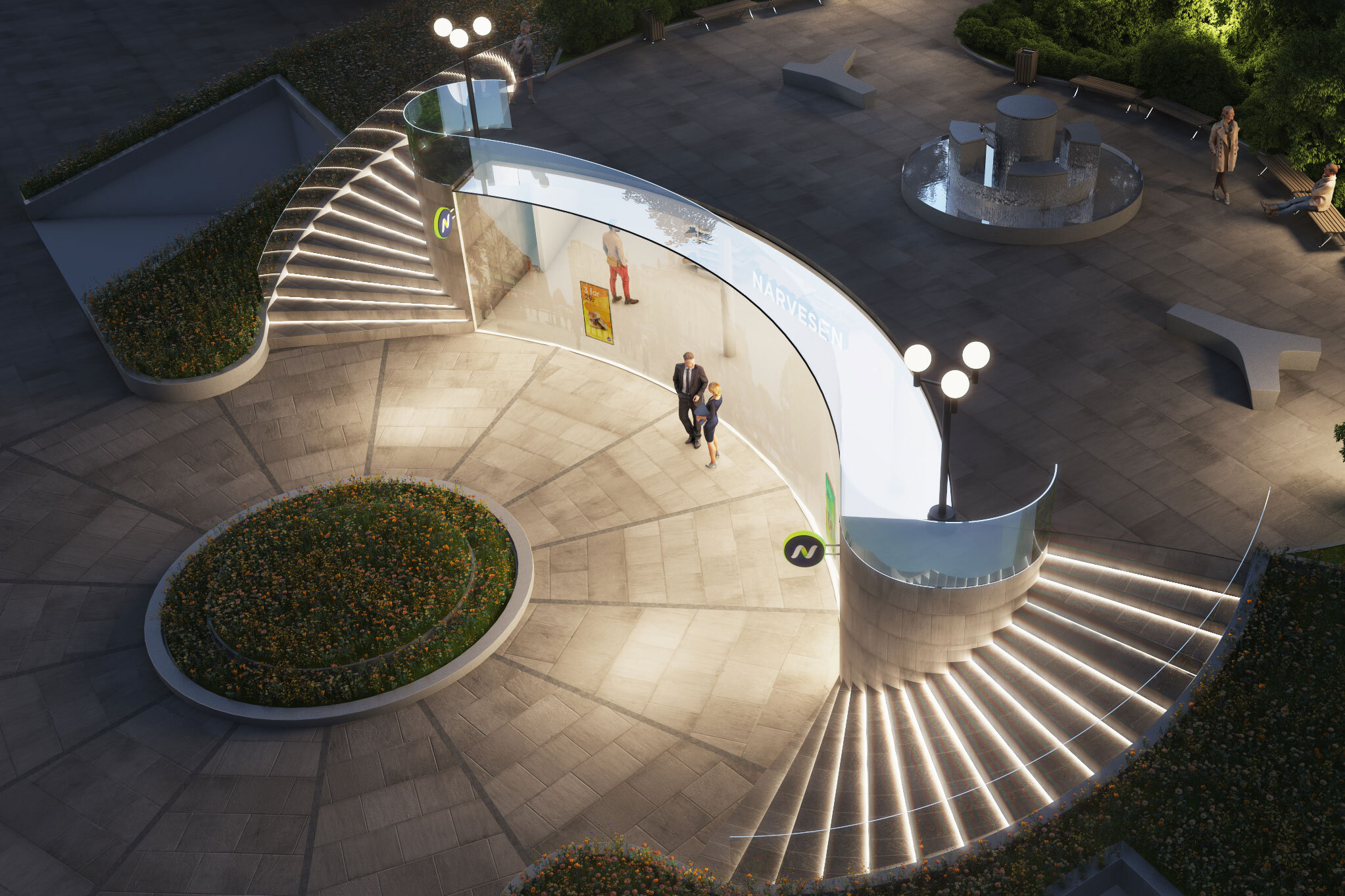
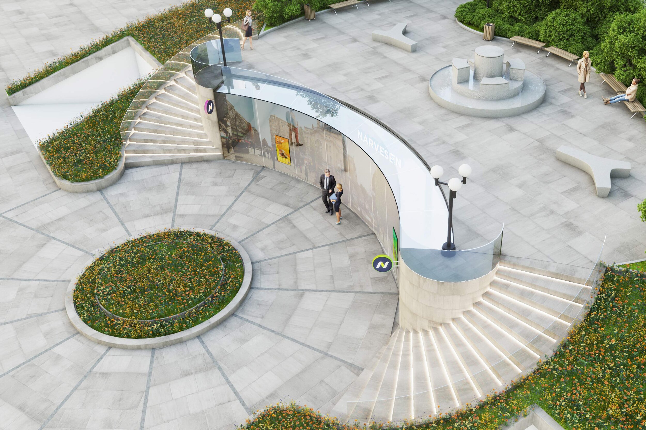
At the time, Narvesen kiosks could be depicted as dull, dusty and dated. This was a stark contrast to specialists offering higher quality and discounters competing on price. A simple lick of paint wouldn’t stop the decline in their customer experience. So as part of Mission’s overhaul of the brand, we were asked to rethink the shops intended for Oslo Airport’s new terminal.
The airport proved to be an excellent testing ground, to rethink convenience store principles. We studied the way customers shop, and identified distinctly different buying habits, where speed was essential. This provided the basis for a new concept called “Flow.” A combination of visual, physical, and service ideas that successfully secured the new terminal's lucrative locations.
Building on this momentum, Narvesen asked us to develop the Flow concept for their shops in various cities, shopping centres and transport hubs across Norway.
Solution
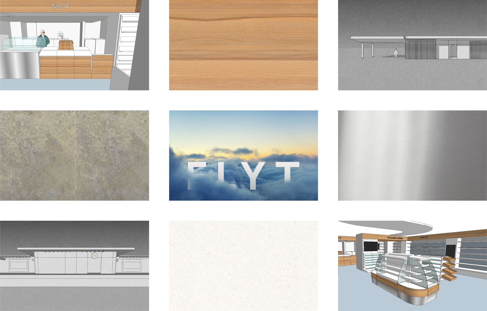
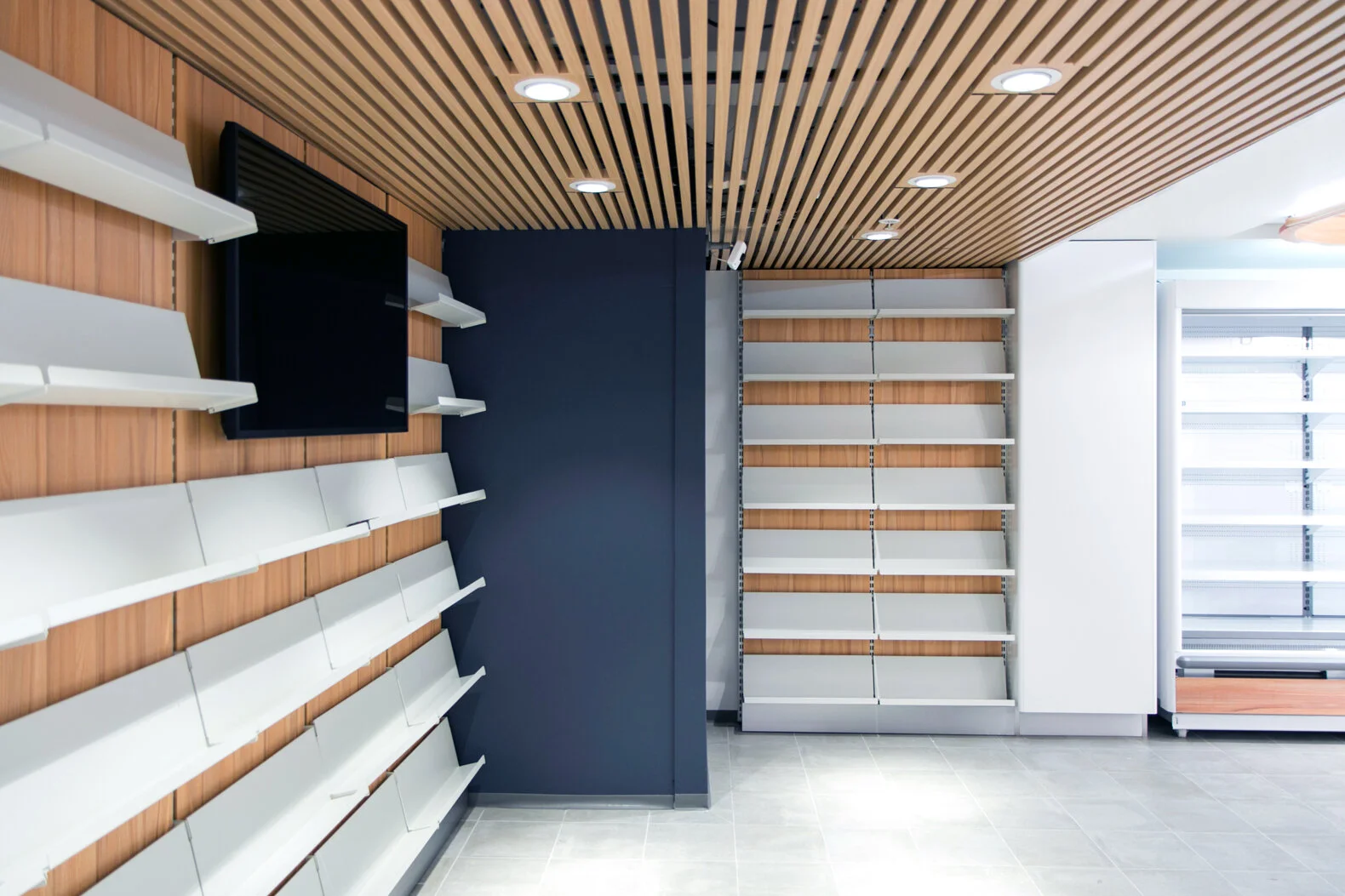
We began by opening up the facades as much as possible, to improve sightlines and allow customers to orient themselves, before crossing the threshold. Signage makes the revised identity visible, with glowing colours that subtly change through the day. As soon as you enter the shop, a ceiling detail, nicknamed the “light-path,” twists and turns from entrance to counter, hiding the ducting and suggesting a fluid route through the shop.
A natural colour palette of oak and warm grey brings a Scandinavian simplicity that’s easier on the eye. While brighter, softer lighting makes the whole space more welcoming. Product categories are clearly signed, directing the customer to the right area, while promotional clutter is confined to large digital screens that animate throughout the shop. The whole atmosphere is easier on the eye, providing a more comfortable space to shop.
Result
The sum of these initiatives culminates in a fresh, open atmosphere, where it’s uncomplicated to shop, meeting the challenges from specialists and discounters, while beating them with a more convenient experience. The concept has proved extremely popular, with new shops seeing an increase of 17% in revenue with customers buying more from the entire range.


Stores were organized by speed zones

Different user scenarios and archetypes were mapped

Sight lines helps customers to quickly get an overview


"We’re all extremely excited by the new concept and Mission’s contribution to this important business initiative."
— Stian Breivik – Category and Marketing Director, Reitan Convenience
(2021)


Results
5.7 billion
Total value of new contracts secured for Reitan Convenience
17%
increased sales in all the new concept stores
The project has reignited the Narvesen brand, a move not lost on Avinor, who selected them as their lead kiosk provider, beating 80 global players in the process. The new Narvesen shops are now open, servicing the 100,000 travellers per month.
Contract for 6 units secured in key locations at Oslo Airport, with a combined value of NOK 2.1 billion
A further 4 units were secured for Flesland airport worth NOK 700 million
30 units connected to Sporveien's lines have a value of 2.9 billion kroner (350 million US dollars)
Reitan Convenience secured contracts with combined value of NOK 5.7 billion


Delivered
Customer analysis
Store concept
Interior design
Signage and wayfinding
Campaigns
Prototypes


“Our customer experience is a paradox. We want customers to enjoy shopping, but that means spending minimal time in shop. Thanks to Mission we’re achieving both.”
Stian Breivik – Category and Marketing Director, Reitan Convenience
(2021)